 |
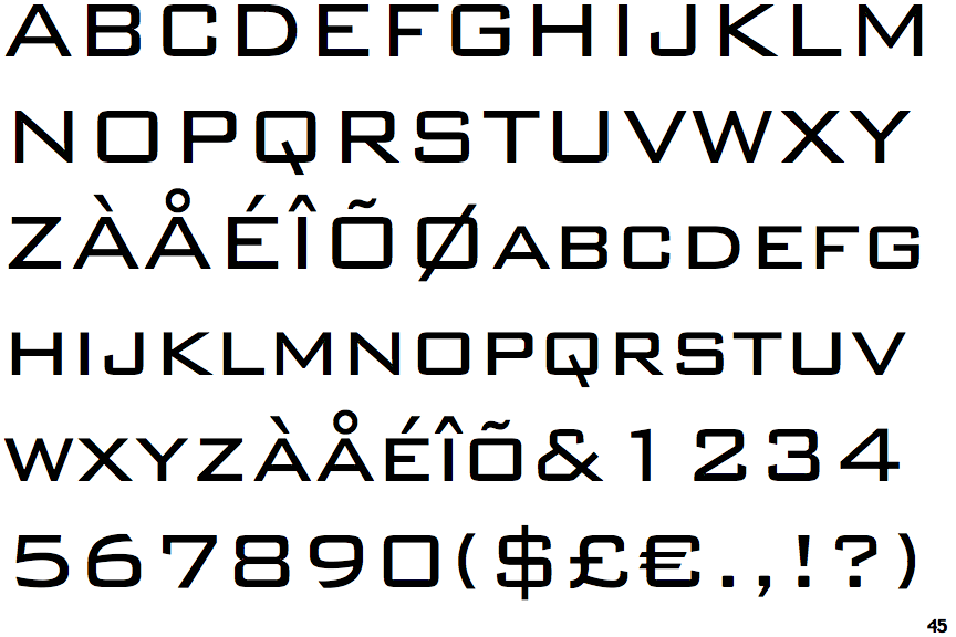
The '&' (ampersand) is traditional style with a gap at the top.
|
 |
The '4' is closed.
|
 |
The diagonal strokes of the upper-case 'K' meet at the vertical (with or without a gap).
|
 |
The upper-case 'J' has no bar.
|
 |
The leg of the upper-case 'R' is straight.
|
 |
The upper-case 'A' has tapered verticals.
|
 |
The upper-case 'E' is normal letter shape.
|
 |
The top of the '7' has a downward-pointing serif or bar.
|
 |
The upper-case letter 'I' is plain.
|
 |
The tail of the upper-case 'Q' is slanted.
|
There are more than ten differences; only the first ten are shown.
Note that the fonts in the icons shown above represent general examples, not necessarily the two fonts chosen for comparison.
Show Examples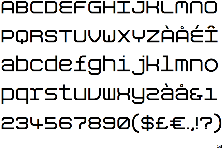
 |
The '&' (ampersand) looks like 'Et' with a gap at the top.
|
 |
The '4' is open.
|
 |
The diagonal strokes of the upper-case 'K' connect to the vertical via a horizontal bar.
|
 |
The upper-case 'J' has a bar to the left.
|
 |
The leg of the upper-case 'R' is curved outwards.
|
 |
The upper-case 'A' has parallel verticals.
|
 |
The upper-case 'E' is drawn as a single stroke (with or without loop).
|
 |
The top of the '7' has no serif or bar.
|
 |
The upper-case letter 'I' has serifs/bars.
|
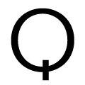 |
The tail of the upper-case 'Q' is vertical.
|