

 |
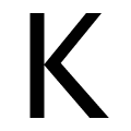
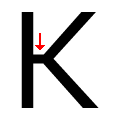
The diagonal strokes of the upper-case 'K' meet at the vertical (with or without a gap).
|
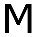 |
The centre vertex of the upper-case 'M' is above the baseline.
|
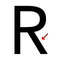 |
The leg of the upper-case 'R' is straight.
|
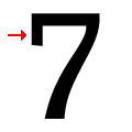 |
The top of the '7' has a downward-pointing serif or bar.
|
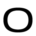 |
The upper-case letter 'O' is wider than it is tall.
|
Note that the fonts in the icons shown above represent general examples, not necessarily the two fonts chosen for comparison.
Show Examples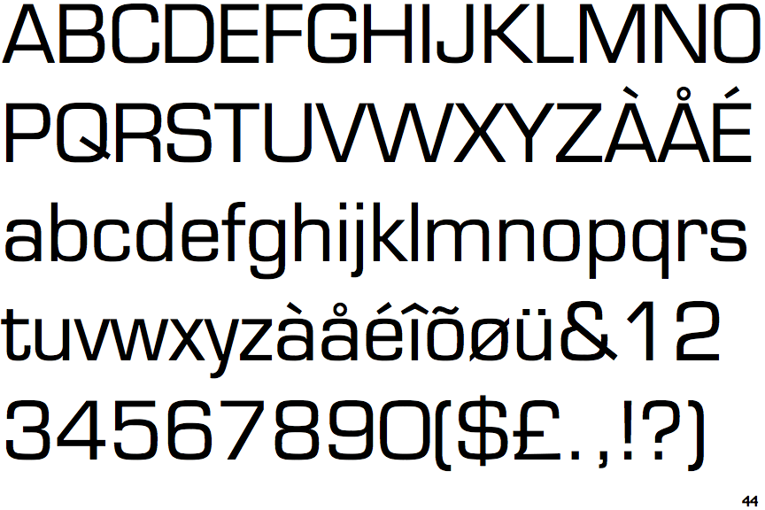
 |
The diagonal strokes of the upper-case 'K' connect to the vertical via a horizontal bar.
|
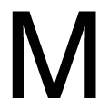 |
The centre vertex of the upper-case 'M' is on the baseline.
|
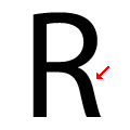 |
The leg of the upper-case 'R' is curved outwards.
|
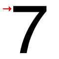 |
The top of the '7' has no serif or bar.
|
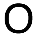 |
The upper-case letter 'O' is taller than it is wide.
|