 |
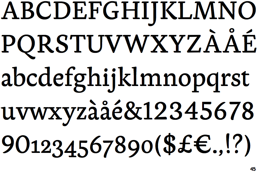
The upper-case 'J' descends below the baseline.
|
 |
The verticals of the upper-case 'M' are sloping.
|
 |
The upper-case 'G' foot has no spur or serif.
|
 |
The foot of the '4' has double-sided serifs.
|
 |
The centre vertex of the upper-case 'W' has no serifs.
|
 |
The top of the '7' has no serif or bar.
|
 |
The upper-case 'C' is asymmetrical about a horizontal axis.
|
 |
The junction of the upper-case 'K' leaves a visible gap with the vertical.
|
Note that the fonts in the icons shown above represent general examples, not necessarily the two fonts chosen for comparison.
Show Examples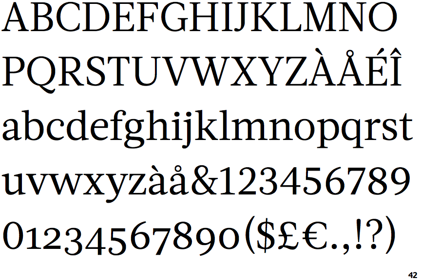
 |
The upper-case 'J' sits on the baseline.
|
 |
The verticals of the upper-case 'M' are parallel.
|
 |
The upper-case 'G' foot has a downward pointing spur.
|
 |
The foot of the '4' has no serifs.
|
 |
The centre vertex of the upper-case 'W' has two separate serifs.
|
 |
The top of the '7' has a downward-pointing serif or bar.
|
 |
The upper-case 'C' is symmetrical about a horizontal axis.
|
 |
The junction of the upper-case 'K' touches the vertical.
|