 |
The upper-case 'Q' tail crosses the circle.
|
 |
The dot on the '?' (question-mark) is circular or oval.
|
 |
The verticals of the upper-case 'M' are parallel.
|
 |
The characters are solid.
|
 |
The upper-case 'G' has a bar to the left.
|
 |
The upper-case 'Y' right-hand arm forms a continuous stroke with the tail.
|
 |
The upper-case 'J' has a bar both sides.
|
 |
The upper-case letter 'I' has serifs/bars.
|
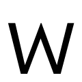 |
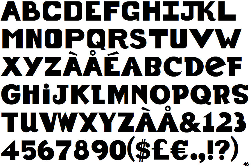
The upper-case 'W' vertices are pointed at the top, flat at the bottom.
|
Note that the fonts in the icons shown above represent general examples, not necessarily the two fonts chosen for comparison.
Show Examples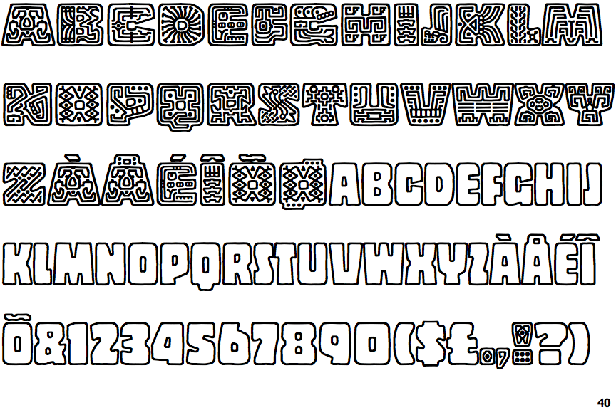
 |
The upper-case 'Q' tail touches the circle.
|
 |
The dot on the '?' (question-mark) is square or rectangular.
|
 |
The verticals of the upper-case 'M' are sloping.
|
 |
The characters are outlined, shaded, or filled with a pattern.
|
 |
The upper-case 'G' has no bar.
|
 |
The upper-case 'Y' arms and tail are separate strokes.
|
 |
The upper-case 'J' has no bar.
|
 |
The upper-case letter 'I' is plain.
|
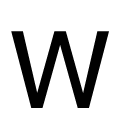 |
The upper-case 'W' vertices are flat at the top and bottom.
|