 |
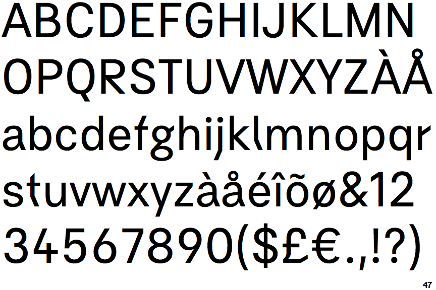
The '&' (ampersand) is traditional style with two enclosed loops.
|
 |
The '4' is open.
|
 |
The dot on the '?' (question-mark) is circular or oval.
|
 |
The lower-case 'g' is double-storey (with or without gap).
|
 |
The leg of the upper-case 'R' is straight.
|
 |
The dot on the lower-case 'i' or 'j' is circular or oval.
|
 |
The right side of the upper-case 'G' is curved.
|
 |
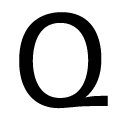
The tail of the upper-case 'Q' is diagonal.
|
Note that the fonts in the icons shown above represent general examples, not necessarily the two fonts chosen for comparison.
Show Examples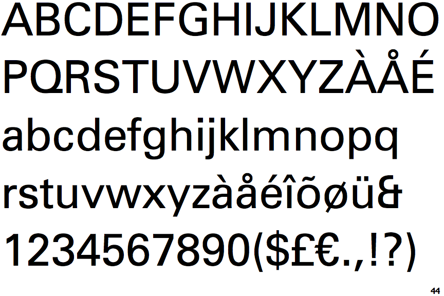
 |
The '&' (ampersand) looks like 'Et' with one enclosed loop (with or without exit stroke).
|
 |
The '4' is closed.
|
 |
The dot on the '?' (question-mark) is square or rectangular.
|
 |
The lower-case 'g' is single-storey (with or without loop).
|
 |
The leg of the upper-case 'R' is curved outwards.
|
 |
The dot on the lower-case 'i' or 'j' is square or rectangular.
|
 |
The right side of the upper-case 'G' has a flat section.
|
 |
The tail of the upper-case 'Q' is horizontal.
|