Identifont

Fonts by Appearance

Fonts by Name

Fonts by Similarity

Fonts by Picture

Fonts by Designer/Publisher

Differences

TweetTweet Differences

Compare: and  

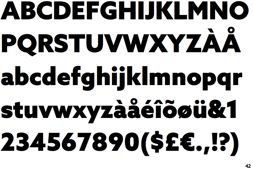
Azo Sans Black

Azo Sans Black

Above
The centre vertex of the upper-case 'M' is above the baseline.
Parallel
The verticals of the upper-case 'M' are parallel.
Left
The upper-case 'G' has a bar to the left.
Curved
The tail of the upper-case 'Q' is curved, S-shaped, or Z-shaped.
Stem
The lower-case 'u' has a stem/serif.

Note that the fonts in the icons shown above represent general examples, not necessarily the two fonts chosen for comparison.

Show Examples
Karbon Bold

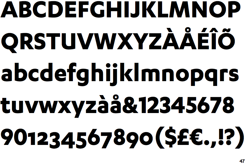
Karbon Bold

Baseline
The centre vertex of the upper-case 'M' is on the baseline.
Sloping
The verticals of the upper-case 'M' are sloping.
No bar
The upper-case 'G' has no bar.
Straight
The tail of the upper-case 'Q' is straight (horizontal, diagonal, or vertical).
No-Stem
The lower-case 'u' has no stem/serif.