 |
The upper-case 'Q' tail touches the circle.
|
 |
The '&' (ampersand) is traditional style with two enclosed loops.
|
 |
The dot on the '?' (question-mark) is circular or oval.
|
 |
The lower-case 'a' stem curves over the top of the bowl (double storey).
|
 |
The upper-case 'J' has no bar.
|
 |
The lower-case 'e' has a straight horizontal bar.
|
 |
The right side of the upper-case 'G' has a flat section.
|
 |
The dot on the lower-case 'i' or 'j' is circular or oval.
|
 |
The tail of the lower-case 'f' sits on the baseline.
|
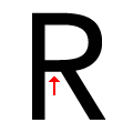 |
The leg of the upper-case 'R' is separated from the vertical by a distinct horizontal section.
|
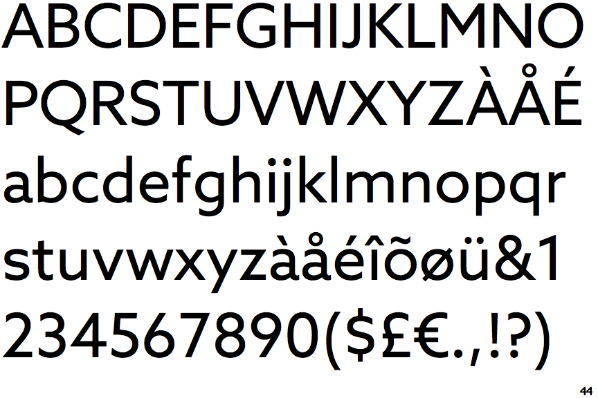
There are more than ten differences; only the first ten are shown.
Note that the fonts in the icons shown above represent general examples, not necessarily the two fonts chosen for comparison.
Show Examples
 |
The upper-case 'Q' tail crosses the circle.
|
 |
The '&' (ampersand) is traditional style with a gap at the top.
|
 |
The dot on the '?' (question-mark) is square or rectangular.
|
 |
The lower-case 'a' stem stops at the top of the bowl (single storey).
|
 |
The upper-case 'J' has a bar to the left.
|
 |
The lower-case 'e' has a straight angled bar.
|
 |
The right side of the upper-case 'G' is curved.
|
 |
The dot on the lower-case 'i' or 'j' is square or rectangular.
|
 |
The tail of the lower-case 'f' descends below the baseline.
|
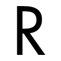 |
The leg of the upper-case 'R' meets the vertical.
|