Identifont

Fonts by Appearance

Fonts by Name

Fonts by Similarity

Fonts by Picture

Fonts by Designer/Publisher

Differences

TweetTweet Differences

Compare: and  

Azo Sans

Azo Sans

Closed
The '&' (ampersand) is traditional style with two enclosed loops.
On
The upper-case 'J' sits on the baseline.
Parallel
The verticals of the upper-case 'M' are parallel.
Horizontal
The lower-case 'e' has a straight horizontal bar.
Straight
The tail of the lower-case 'y' is substantially straight.

Note that the fonts in the icons shown above represent general examples, not necessarily the two fonts chosen for comparison.

Show Examples
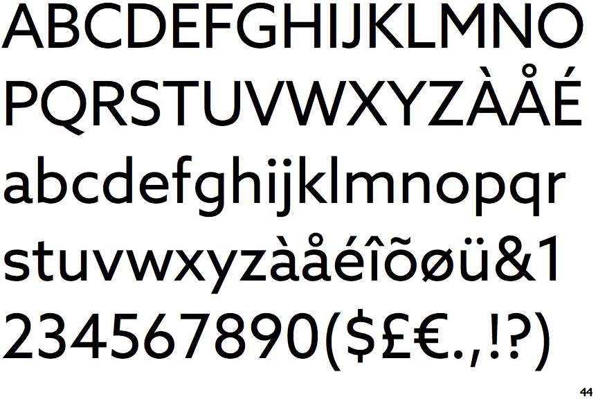
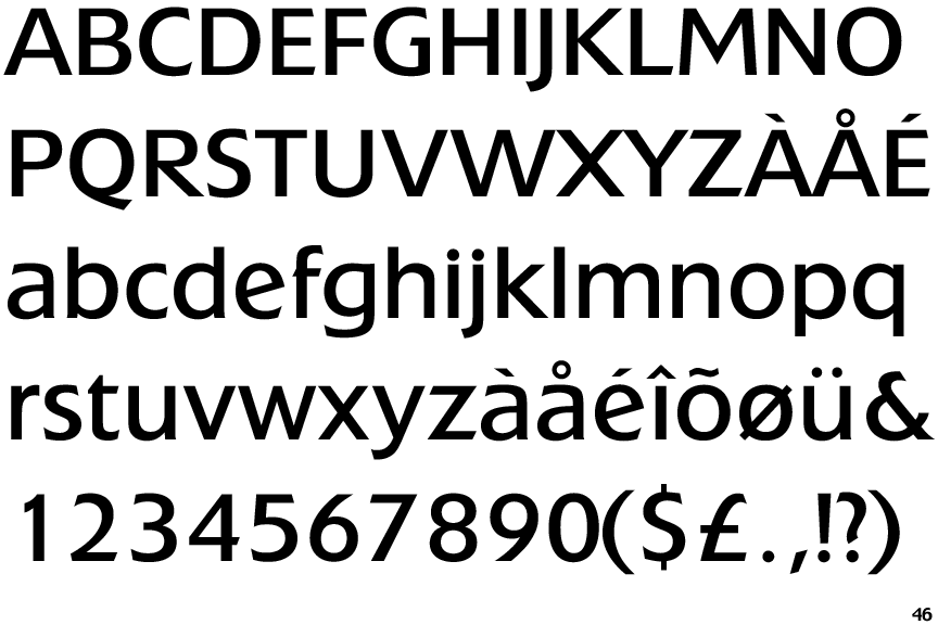
Extension

Extension

Open
The '&' (ampersand) is traditional style with a gap at the top.
Below
The upper-case 'J' descends below the baseline.
Sloping
The verticals of the upper-case 'M' are sloping.
Sloping
The lower-case 'e' has a straight angled bar.
Left
The tail of the lower-case 'y' is curved or U-shaped to the left.