Identifont

Fonts by Appearance

Fonts by Name

Fonts by Similarity

Fonts by Picture

Fonts by Designer/Publisher

Differences

TweetTweet Differences

Compare: and  

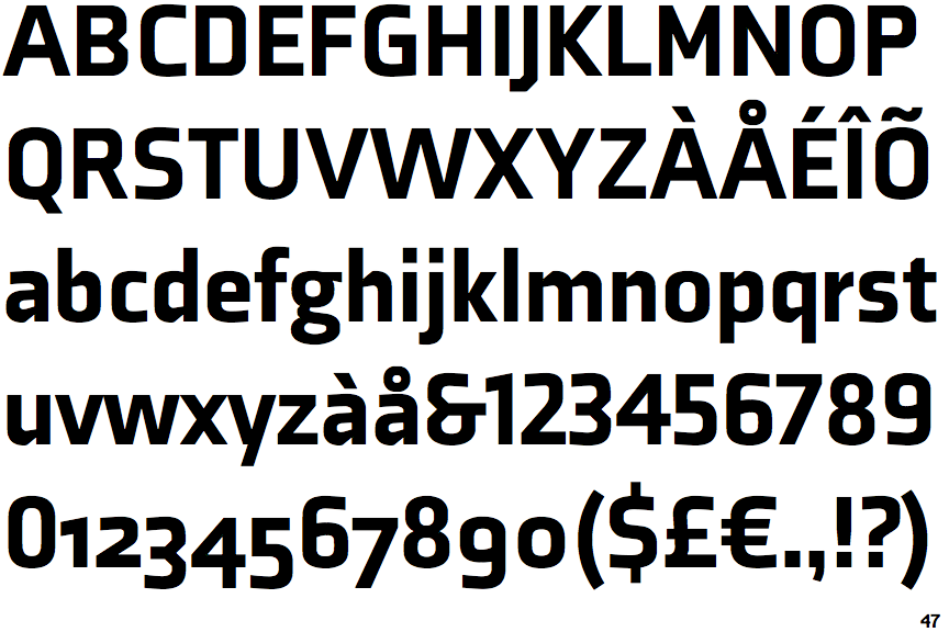
Axia Black

Axia Black

Below
The upper-case 'J' descends below the baseline.
Closed
The '4' is closed.
2-Storey
The lower-case 'g' is double-storey (with or without gap).
Straight
The tail of the upper-case 'Q' is straight (horizontal, diagonal, or vertical).
Plain
The upper-case letter 'I' is plain.

Note that the fonts in the icons shown above represent general examples, not necessarily the two fonts chosen for comparison.

Show Examples
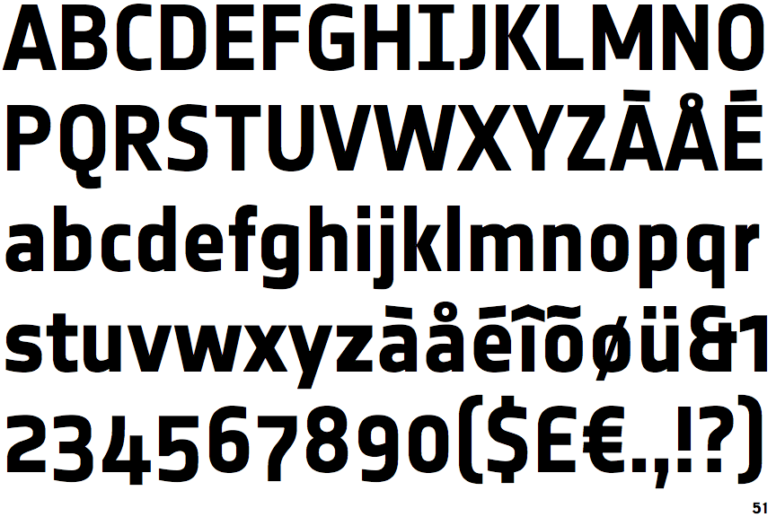
PTL Notes Bold

PTL Notes Bold

On
The upper-case 'J' sits on the baseline.
Open
The '4' is open.
1-Storey
The lower-case 'g' is single-storey (with or without loop).
Curved
The tail of the upper-case 'Q' is curved, S-shaped, or Z-shaped.
Serifs
The upper-case letter 'I' has serifs/bars.