Identifont

Fonts by Appearance

Fonts by Name

Fonts by Similarity

Fonts by Picture

Fonts by Designer/Publisher

Differences

TweetTweet Differences

Compare: and  

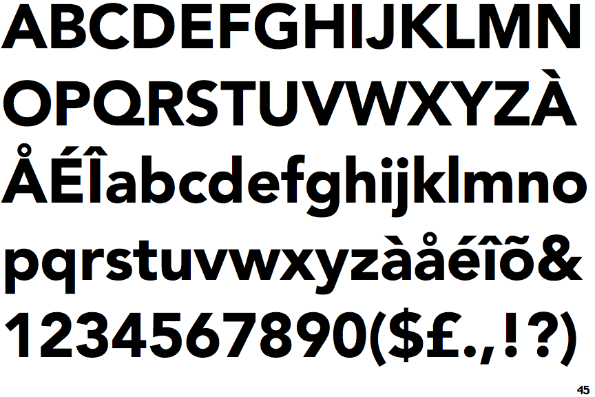
Avenir Black

Avenir Black

Touches
The upper-case 'Q' tail touches the circle.
Parallel
The verticals of the upper-case 'M' are parallel.
Round
The top storey of the '3' is a smooth curve.
Flat
The right side of the upper-case 'G' has a flat section.

Note that the fonts in the icons shown above represent general examples, not necessarily the two fonts chosen for comparison.

Show Examples
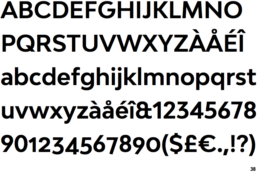
Bw Modelica Bold

Bw Modelica Bold

Crosses
The upper-case 'Q' tail crosses the circle.
Sloping
The verticals of the upper-case 'M' are sloping.
Angled
The top storey of the '3' is a sharp angle.
Curved
The right side of the upper-case 'G' is curved.