Identifont

Fonts by Appearance

Fonts by Name

Fonts by Similarity

Fonts by Picture

Fonts by Designer/Publisher

Differences

TweetTweet Differences

Compare: and  

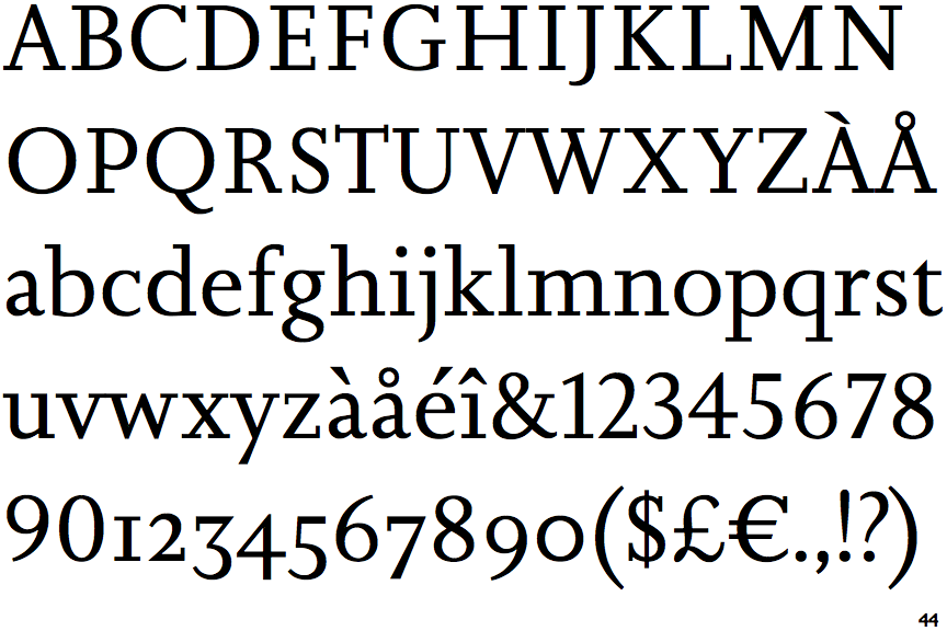
Augustin

Augustin

Bar
The diagonal strokes of the upper-case 'K' connect to the vertical via a horizontal bar.
Sloping
The verticals of the upper-case 'M' are sloping.
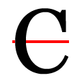
No top serif
The top stroke of the upper-case 'C' has no upward-pointing serif.
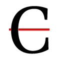
Symmetrical
The upper-case 'C' is symmetrical about a horizontal axis.

Note that the fonts in the icons shown above represent general examples, not necessarily the two fonts chosen for comparison.

Show Examples
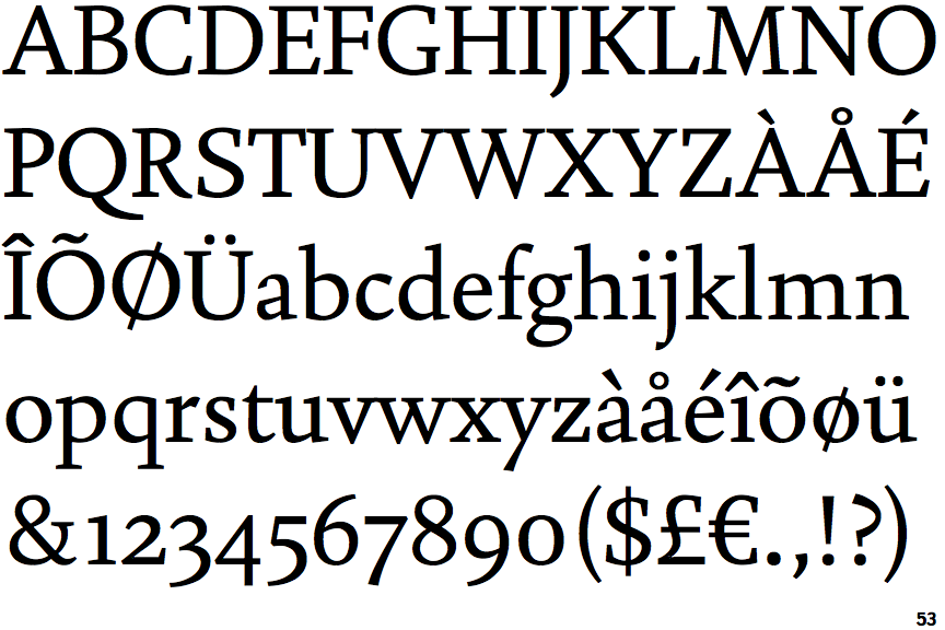
Joanna Nova

Joanna Nova

Single
The diagonal strokes of the upper-case 'K' meet at the vertical (with or without a gap).
Parallel
The verticals of the upper-case 'M' are parallel.
Top serif
The top stroke of the upper-case 'C' has a vertical or angled upward-pointing serif.
Asymmetrical
The upper-case 'C' is asymmetrical about a horizontal axis.