Identifont

Fonts by Appearance

Fonts by Name

Fonts by Similarity

Fonts by Picture

Fonts by Designer/Publisher

Differences

TweetTweet Differences

Compare: and  

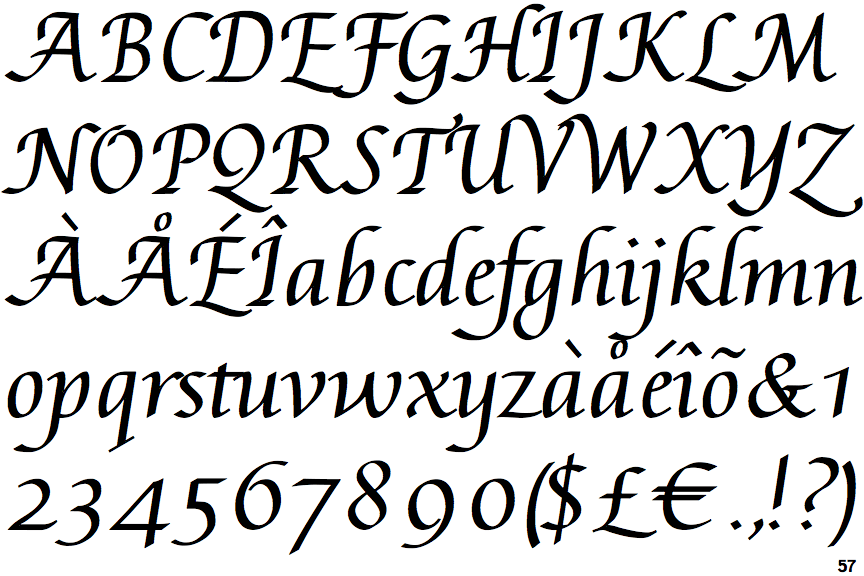
Augusta Cancellaresca

Augusta Cancellaresca

Gap
The centre bar of the upper-case 'P' leaves a gap with the vertical.
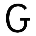
Left
The upper-case 'G' has a bar to the left.
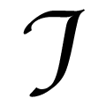
Flourish
The upper-case 'I' is a stroke with a flourish on top - not closed.
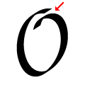
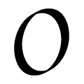
Not Smooth
The upper-case letter 'O' has a discontinuity or gap.

Note that the fonts in the icons shown above represent general examples, not necessarily the two fonts chosen for comparison.

Show Examples
ITC Zapf Chancery Italic

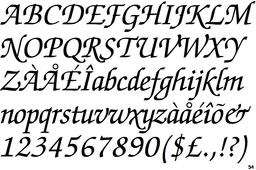
ITC Zapf Chancery Italic

Meets
The centre bar of the upper-case 'P' meets the vertical.
Double
The upper-case 'G' has double-sided bar.
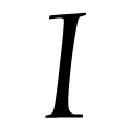
Serifs
The upper-case 'I' is a single stroke with serifs.
Smooth
The upper-case letter 'O' has a smooth outline with no discontinuity or gap.