 |
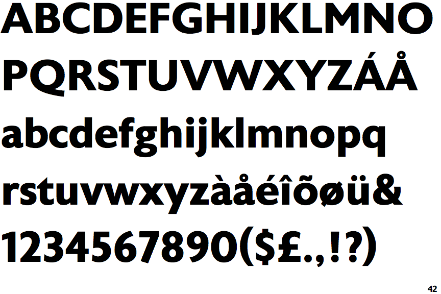
The upper-case 'Q' tail touches the circle.
|
 |
The '&' (ampersand) is traditional style with two enclosed loops.
|
 |
The '4' is closed.
|
 |
The dot on the '?' (question-mark) is circular or oval.
|
 |
The upper-case 'A' has tapered verticals.
|
 |
The dot on the lower-case 'i' or 'j' is circular or oval.
|
Note that the fonts in the icons shown above represent general examples, not necessarily the two fonts chosen for comparison.
Show Examples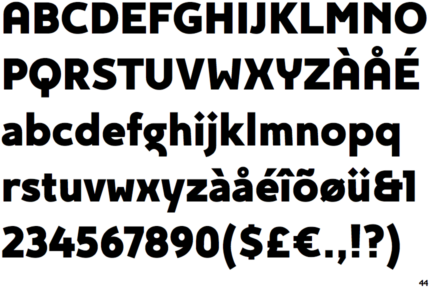
 |
The upper-case 'Q' tail crosses the circle.
|
 |
The '&' (ampersand) looks like 'Et' with one enclosed loop (with or without exit stroke).
|
 |
The '4' is open.
|
 |
The dot on the '?' (question-mark) is square or rectangular.
|
 |
The upper-case 'A' has parallel verticals.
|
 |
The dot on the lower-case 'i' or 'j' is diamond-shaped.
|