 |
The top of the lower-case 'q' has no spur or serif.
|
 |
The centre vertex of the upper-case 'W' has no serifs.
|
 |
The tail of the upper-case 'Q' is curved, S-shaped, or Z-shaped.
|
 |
The top vertices of the upper-case 'M' have symmetrical single-sided serifs.
|
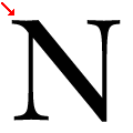 |
The top-left vertex of the upper-case 'N' has one serif.
|
Note that the fonts in the icons shown above represent general examples, not necessarily the two fonts chosen for comparison.
Show Examples
 |
The top of the lower-case 'q' has a right-facing serif.
|
 |
The centre vertex of the upper-case 'W' has two separate serifs.
|
 |
The tail of the upper-case 'Q' is straight (horizontal, diagonal, or vertical).
|
 |
The top vertices of the upper-case 'M' have no top serifs.
|
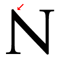 |
The top-left vertex of the upper-case 'N' has no serifs.
|