 |
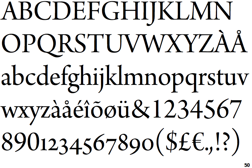
The top of the lower-case 'q' has no spur or serif.
|
 |
The foot of the '4' has no serifs.
|
 |
The centre vertex of the upper-case 'W' has no serifs.
|
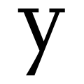 |
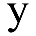
The tail of the lower-case 'y' is straight or pointed.
|
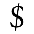 |
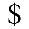
The line of the '$' (dollar) is slanted.
|
Note that the fonts in the icons shown above represent general examples, not necessarily the two fonts chosen for comparison.
Show Examples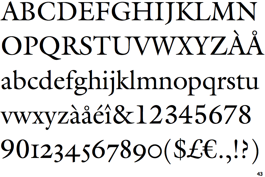
 |
The top of the lower-case 'q' has a vertical or slightly angled spur (pointed or flat).
|
 |
The foot of the '4' has double-sided serifs.
|
 |
The centre vertex of the upper-case 'W' has two separate serifs.
|
 |
The tail of the lower-case 'y' is curved with a rounded end or ball.
|
 |
The line of the '$' (dollar) is vertical.
|