 |
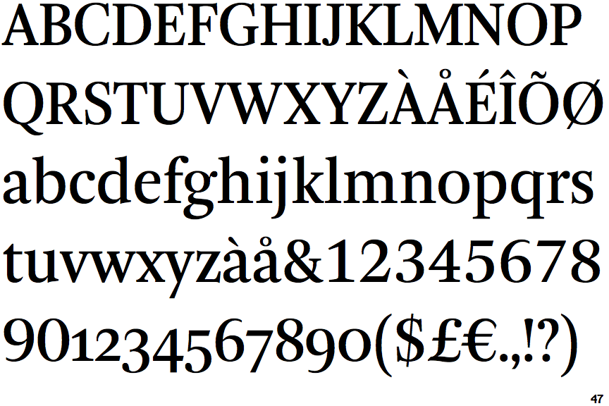
The upper-case 'J' sits on the baseline.
|
 |
The dot on the '?' (question-mark) is circular or oval.
|
 |
The top stroke of the upper-case 'C' has a vertical or angled upward-pointing serif.
|
 |
The top of the lower-case 'q' has a right-facing serif.
|
 |
The tail of the upper-case 'J' has a rounded end or ball.
|
 |
The dot on the lower-case 'i' or 'j' is circular or oval.
|
 |
The centre vertex of the upper-case 'W' has two separate serifs.
|
 |
The feet of the lower-case 'm' have two serifs on each foot.
|
Note that the fonts in the icons shown above represent general examples, not necessarily the two fonts chosen for comparison.
Show Examples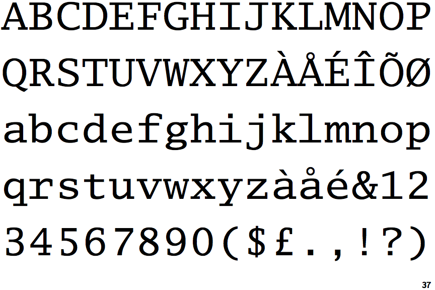
 |
The upper-case 'J' descends below the baseline.
|
 |
The dot on the '?' (question-mark) is square or rectangular.
|
 |
The top stroke of the upper-case 'C' has no upward-pointing serif.
|
 |
The top of the lower-case 'q' has a vertical or slightly angled spur (pointed or flat).
|
 |
The tail of the upper-case 'J' has a flat end or cusp.
|
 |
The dot on the lower-case 'i' or 'j' is square or rectangular.
|
 |
The centre vertex of the upper-case 'W' has no serifs.
|
 |
The feet of the lower-case 'm' have two serifs on the left, and one on the centre and right.
|