Identifont

Fonts by Appearance

Fonts by Name

Fonts by Similarity

Fonts by Picture

Fonts by Designer/Publisher

Differences

TweetTweet Differences

Compare: and  

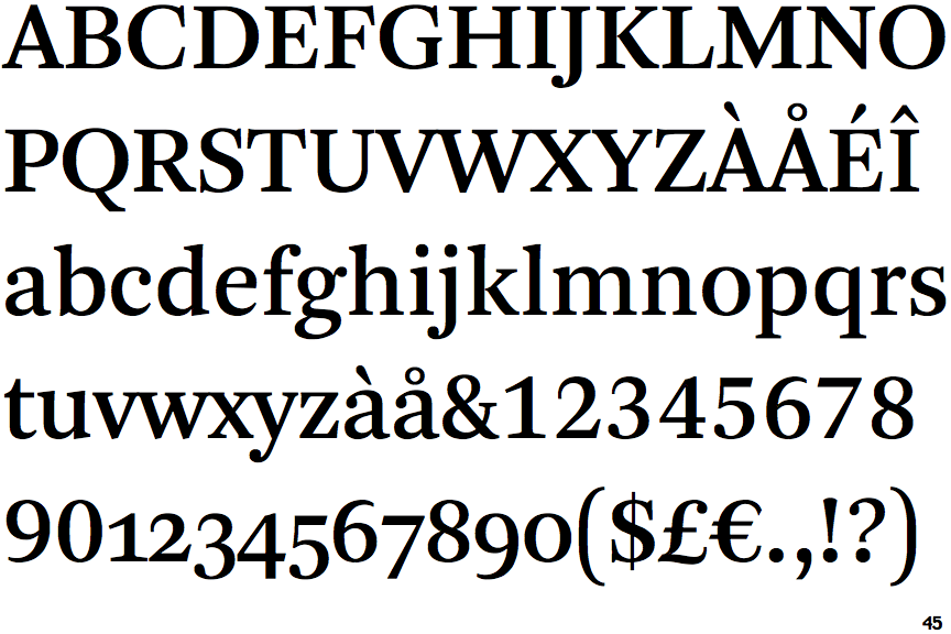
Arnhem

Arnhem

Below
The upper-case 'J' descends below the baseline.
Both
The centre vertex of the upper-case 'W' has two separate serifs.

Note that the fonts in the icons shown above represent general examples, not necessarily the two fonts chosen for comparison.

Show Examples
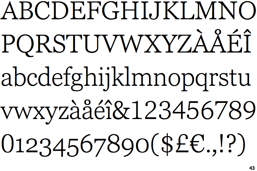
Georgia Pro Light

Georgia Pro Light

On
The upper-case 'J' sits on the baseline.
None
The centre vertex of the upper-case 'W' has no serifs.