 |
The diagonal strokes of the upper-case 'K' meet at the vertical (with or without a gap).
|
 |
The centre bar of the upper-case 'P' meets the vertical.
|
 |
The top stroke of the upper-case 'C' has a vertical or angled upward-pointing serif.
|
 |
The top of the upper-case 'W' has three upper terminals.
|
 |
The top of the '7' has no serif or bar.
|
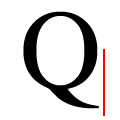 |
The tail of the upper-case 'Q' lies within the bowl width.
|
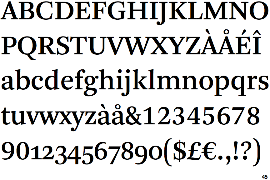
Note that the fonts in the icons shown above represent general examples, not necessarily the two fonts chosen for comparison.
Show Examples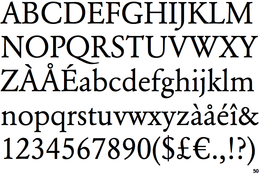
 |
The diagonal strokes of the upper-case 'K' meet in a 'T'.
|
 |
The centre bar of the upper-case 'P' leaves a gap with the vertical.
|
 |
The top stroke of the upper-case 'C' has no upward-pointing serif.
|
 |
The top of the upper-case 'W' has four upper terminals.
|
 |
The top of the '7' has a downward-pointing serif or bar.
|
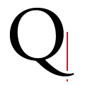 |
The tail of the upper-case 'Q' extends beyond the bowl width.
|