 |
The centre vertex of the upper-case 'M' is above the baseline.
|
 |
The upper-case 'A' has tapered verticals.
|
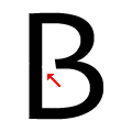 |
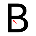
The centre bar of the upper-case 'B' leaves a gap with the vertical.
|
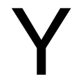 |
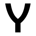
The arms of the upper-case 'Y' are straight.
|
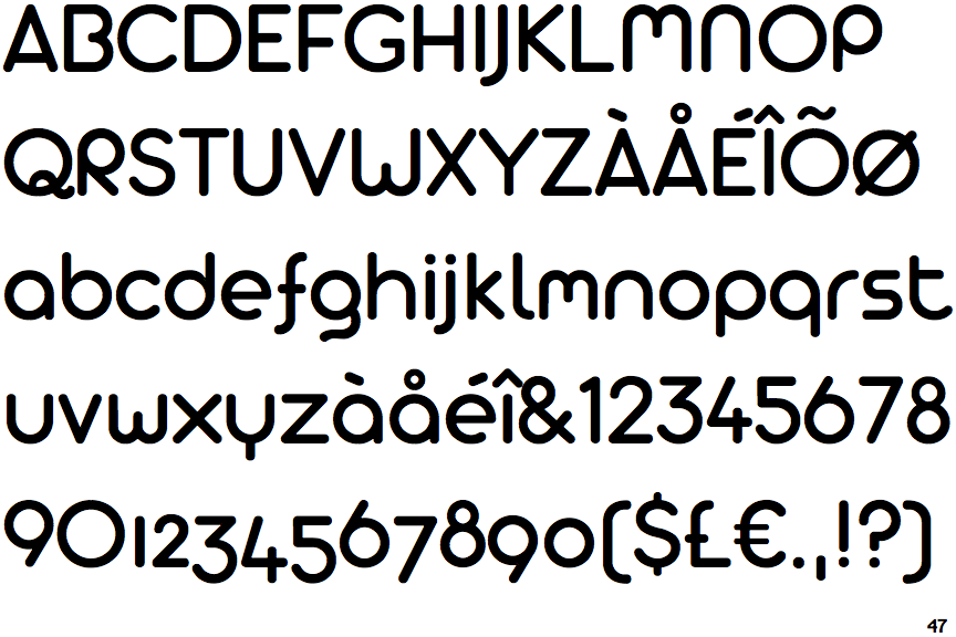
Note that the fonts in the icons shown above represent general examples, not necessarily the two fonts chosen for comparison.
Show Examples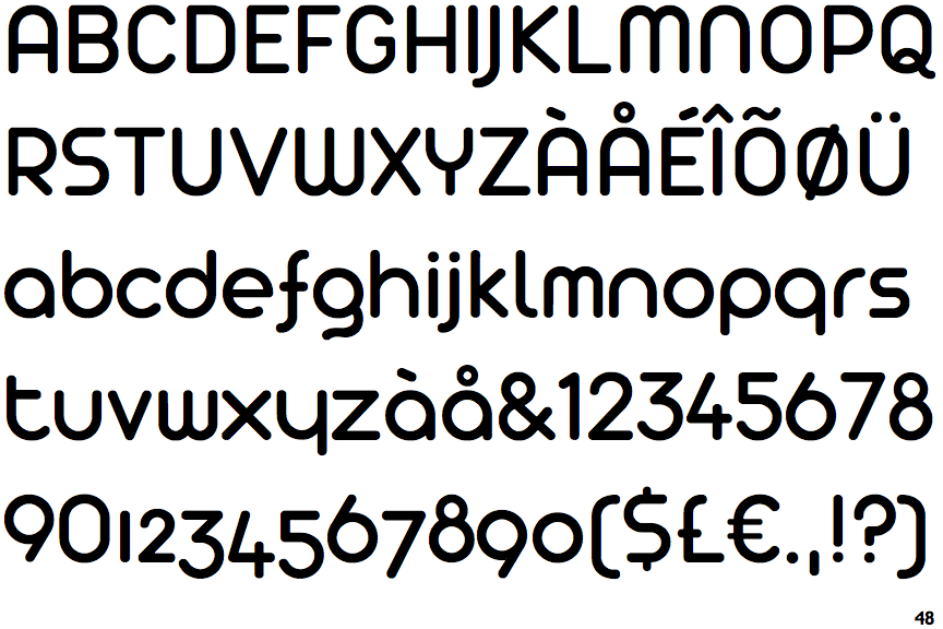
 |
The centre vertex of the upper-case 'M' is on the baseline.
|
 |
The upper-case 'A' has parallel verticals.
|
 |
The centre bar of the upper-case 'B' meets the vertical.
|
 |
The arms of the upper-case 'Y' are curved, concave.
|