 |
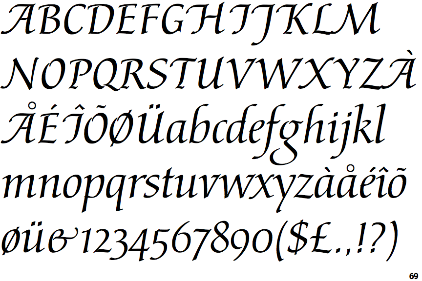
The lower-case 'g' is double-storey (with or without gap).
|
 |
The upper-case 'G' has a bar to the left.
|
 |
The top of the upper-case 'A' has a serif or cusp on the left.
|
 |
The upper-case 'J' has a bar to the left.
|
 |
The centre bar of the upper-case 'R' leaves a gap with the vertical.
|
 |
The bar of the upper-case 'G' is single-sided, left-facing.
|
 |
The tail of the lower-case 'y' is substantially straight.
|
 |
The upper-case 'I' is a stroke with a flourish on top - not closed.
|
 |
The tail of the lower-case 'y' is substantially straight.
|
Note that the fonts in the icons shown above represent general examples, not necessarily the two fonts chosen for comparison.
Show Examples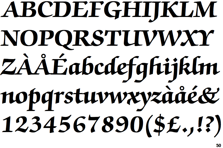
 |
The lower-case 'g' is single-storey (with or without loop).
|
 |
The upper-case 'G' has double-sided bar.
|
 |
The top of the upper-case 'A' has no serifs or cusps.
|
 |
The upper-case 'J' has a bar both sides.
|
 |
The centre bar of the upper-case 'R' meets the vertical.
|
 |
The bar of the upper-case 'G' is double-sided.
|
 |
The tail of the lower-case 'y' is curved or U-shaped to the left.
|
 |
The upper-case 'I' is a single stroke with serifs.
|
 |
The tail of the lower-case 'y' curves or points to the left without a loop.
|