 |
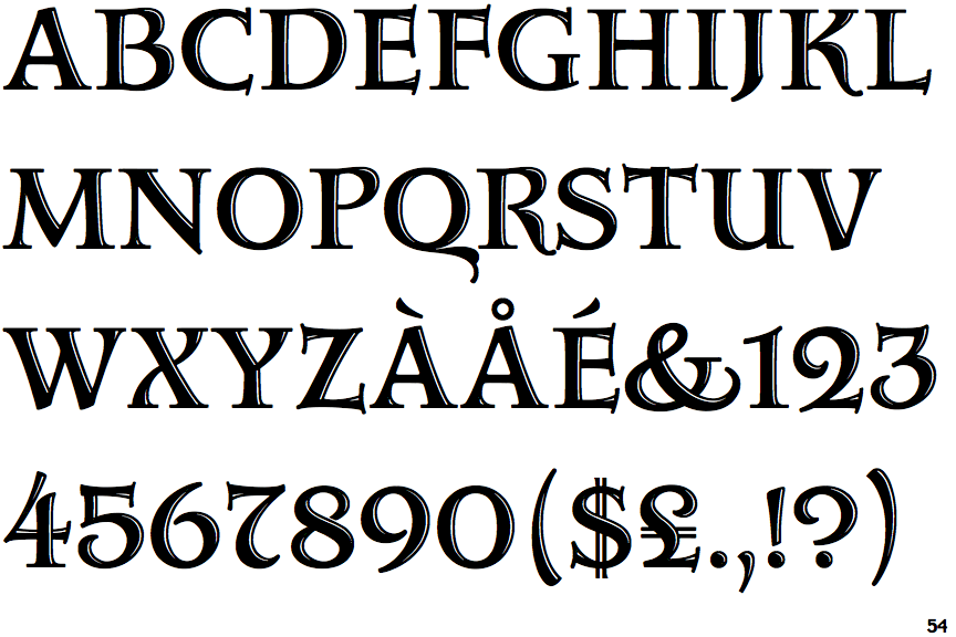
The '$' (dollar) has a double line crossing the 'S'.
|
 |
The upper-case 'J' descends below the baseline.
|
 |
The '4' is open.
|
 |
The diagonal strokes of the upper-case 'K' meet at the vertical (with or without a gap).
|
 |
The verticals of the upper-case 'M' are sloping.
|
 |
The upper-case 'U' has a stem/serif.
|
 |
The top stroke of the upper-case 'C' has a vertical or angled upward-pointing serif.
|
 |
The upper-case 'G' foot has a forward pointing spur or serif.
|
 |
The centre bar of the upper-case 'R' leaves a gap with the vertical.
|
 |
The top vertices of the upper-case 'M' have symmetrical double-sided serifs.
|
Note that the fonts in the icons shown above represent general examples, not necessarily the two fonts chosen for comparison.
Show Examples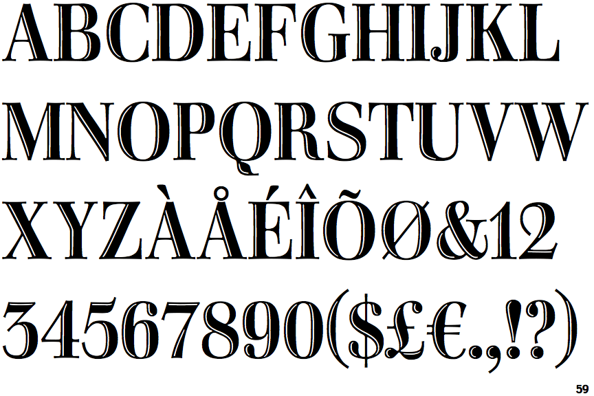
 |
The '$' (dollar) has a single line crossing the 'S'.
|
 |
The upper-case 'J' sits on the baseline.
|
 |
The '4' is closed.
|
 |
The diagonal strokes of the upper-case 'K' connect to the vertical via a horizontal bar.
|
 |
The verticals of the upper-case 'M' are parallel.
|
 |
The upper-case 'U' has no stem/serif.
|
 |
The top stroke of the upper-case 'C' has no upward-pointing serif.
|
 |
The upper-case 'G' foot has no spur or serif.
|
 |
The centre bar of the upper-case 'R' meets the vertical.
|
 |
The top vertices of the upper-case 'M' have symmetrical single-sided serifs.
|