Identifont

Fonts by Appearance

Fonts by Name

Fonts by Similarity

Fonts by Picture

Fonts by Designer/Publisher

Differences

TweetTweet Differences

Compare: and  

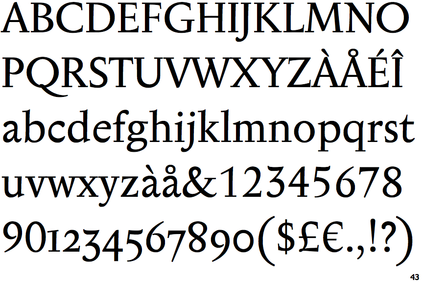
Anselm Serif

Anselm Serif

Single
The diagonal strokes of the upper-case 'K' meet at the vertical (with or without a gap).
Sloping
The verticals of the upper-case 'M' are sloping.
Angled
The top storey of the '3' is a sharp angle.
Both
The centre vertex of the upper-case 'W' has two separate serifs.
Upward
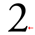
The base of the '2' has an upward-pointing serif.

Note that the fonts in the icons shown above represent general examples, not necessarily the two fonts chosen for comparison.

Show Examples
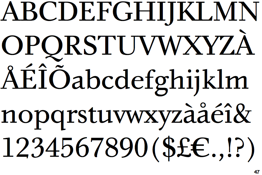
Bingo Serif

Bingo Serif

Double
The diagonal strokes of the upper-case 'K' meet in a 'T'.
Parallel
The verticals of the upper-case 'M' are parallel.
Round
The top storey of the '3' is a smooth curve.
None
The centre vertex of the upper-case 'W' has no serifs.
Downward
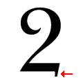
The base of the '2' has a downward-pointing serif.