

 |
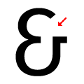
The '&' (ampersand) looks like 'Et' with a gap at the top.
|
 |
The centre vertex of the upper-case 'M' is above the baseline.
|
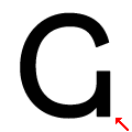 |
The upper-case 'G' has a spur/tail.
|
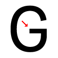 |
The upper-case 'G' has a bar to the left.
|
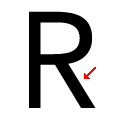 |
The leg of the upper-case 'R' is straight.
|
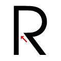 |
The centre bar of the upper-case 'R' leaves a gap with the vertical.
|
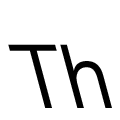 |
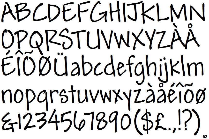
The strokes are sloped left (backslant or linkskursiv).
|
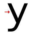 |
The sides of the lower-case 'y' are angled (V-shaped).
|
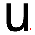 |
The lower-case 'u' has a stem/serif.
|
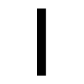 |
The upper-case letter 'I' is plain.
|
There are more than ten differences; only the first ten are shown.
Note that the fonts in the icons shown above represent general examples, not necessarily the two fonts chosen for comparison.
Show Examples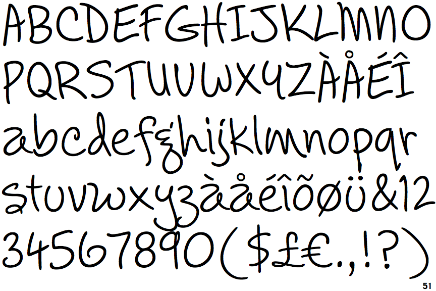
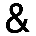 |
The '&' (ampersand) is traditional style with two enclosed loops.
|
 |
The centre vertex of the upper-case 'M' is on the baseline.
|
 |
The upper-case 'G' has no spur/tail.
|
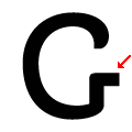 |
The upper-case 'G' has a bar to the right.
|
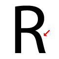 |
The leg of the upper-case 'R' is curved outwards.
|
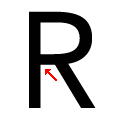 |
The centre bar of the upper-case 'R' meets the vertical.
|
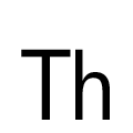 |
The strokes are upright.
|
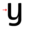 |
The sides of the lower-case 'y' are parallel (U-shaped).
|
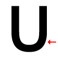 |
The lower-case 'u' has no stem/serif.
|
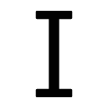 |
The upper-case letter 'I' has serifs/bars.
|