 |
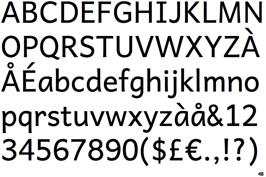
The upper-case 'Q' tail touches the circle.
|
 |
The '4' is closed.
|
 |
The centre vertex of the upper-case 'M' is on the baseline.
|
 |
The verticals of the upper-case 'M' are sloping.
|
 |
The 'l' (lower-case 'L') has no serifs or tail.
|
 |
The strokes are upright.
|
 |
The sides of the lower-case 'y' are angled (V-shaped).
|
 |
The lower-case 'e' has a straight horizontal bar.
|
 |
The lower-case 'i' has no serifs or tail.
|
 |
The tail of the lower-case 'f' sits on the baseline.
|
Note that the fonts in the icons shown above represent general examples, not necessarily the two fonts chosen for comparison.
Show Examples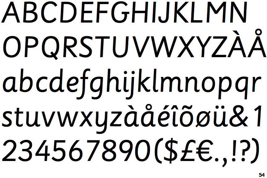
 |
The upper-case 'Q' tail crosses the circle.
|
 |
The '4' is open.
|
 |
The centre vertex of the upper-case 'M' is above the baseline.
|
|
The verticals of the upper-case 'M' are parallel.
|
 |
The 'l' (lower-case 'L') has a right-facing lower serif or tail.
|
 |
The strokes are sloped right (italic, oblique, or cursive).
|
 |
The sides of the lower-case 'y' are parallel (U-shaped).
|
 |
The lower-case 'e' has a curved bar with no straight segment.
|
 |
The lower-case 'i' has a right-facing lower serif or tail.
|
 |
The tail of the lower-case 'f' descends below the baseline.
|