Identifont

Fonts by Appearance

Fonts by Name

Fonts by Similarity

Fonts by Picture

Fonts by Designer/Publisher

Differences

TweetTweet Differences

Compare: and  

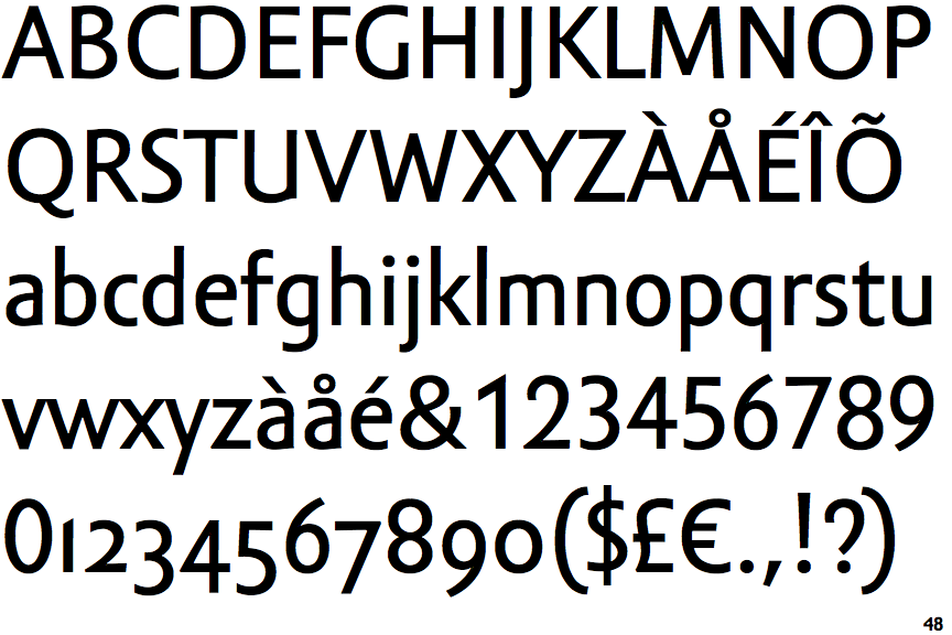
Amor Sans Text

Amor Sans Text

1-Storey
The lower-case 'g' is single-storey (with or without loop).
Curved
The tail of the upper-case 'Q' is curved, S-shaped, or Z-shaped.
Flat-Flat
The upper-case 'M' vertices are flat at the top and bottom.

Note that the fonts in the icons shown above represent general examples, not necessarily the two fonts chosen for comparison.

Show Examples
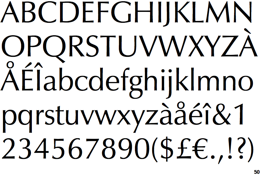
Zapf Humanist 601

Zapf Humanist 601

2-Storey
The lower-case 'g' is double-storey (with or without gap).
Straight
The tail of the upper-case 'Q' is straight (horizontal, diagonal, or vertical).
Pointed-Pointed
The upper-case 'M' vertices are pointed at the top and bottom.