 |
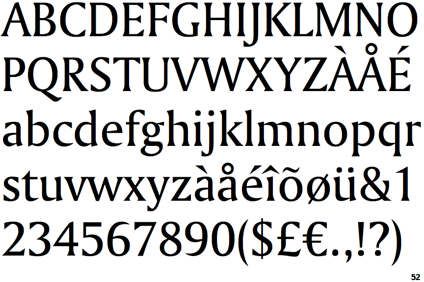
The centre vertex of the upper-case 'M' is on the baseline.
|
 |
The top storey of the '3' is a smooth curve.
|
 |
The upper-case 'U' has no stem/serif.
|
 |
The top of the lower-case 'q' has a vertical or slightly angled spur (pointed or flat).
|
 |
The tail of the upper-case 'J' has a flat end or cusp.
|
 |
The junction of the upper-case 'K' leaves a visible gap with the vertical.
|
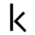 |
The junction of the lower-case 'k' has a visible gap.
|
Note that the fonts in the icons shown above represent general examples, not necessarily the two fonts chosen for comparison.
Show Examples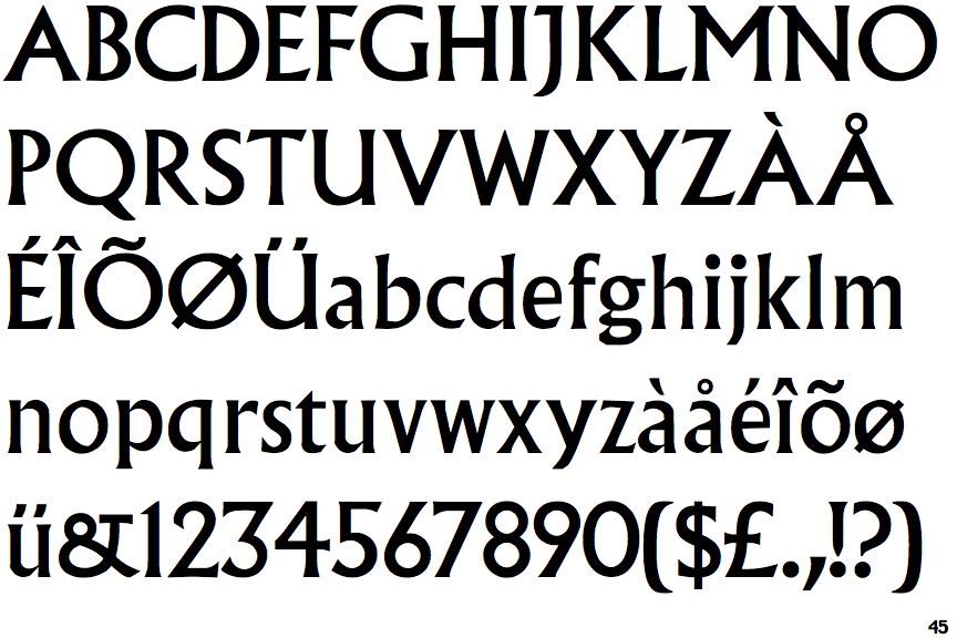
 |
The centre vertex of the upper-case 'M' is above the baseline.
|
 |
The top storey of the '3' is a sharp angle.
|
 |
The upper-case 'U' has a stem/serif.
|
 |
The top of the lower-case 'q' has no spur or serif.
|
 |
The tail of the upper-case 'J' has a tapered end.
|
 |
The junction of the upper-case 'K' touches the vertical.
|
 |
The junction of the lower-case 'k' has no gap.
|