 |
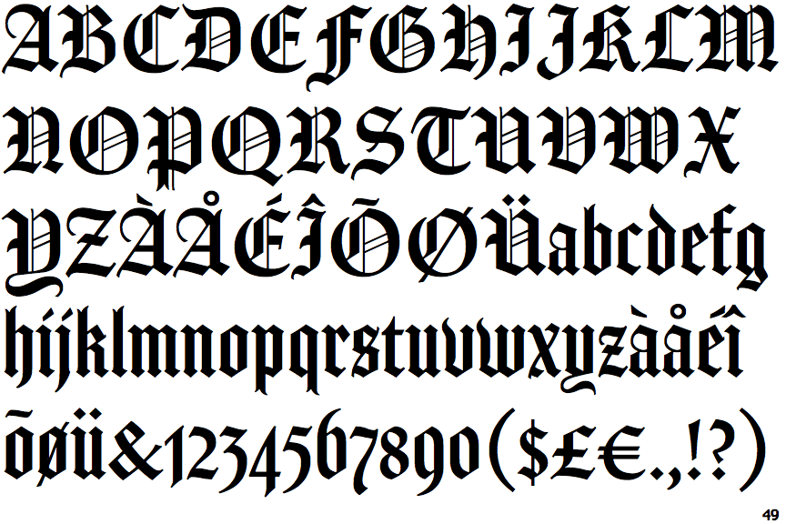
The upper-case 'Q' tail touches the circle.
|
 |
The top storey of the '3' is a sharp angle.
|
 |
The upper-case 'E' is drawn as a 'C' with a bar.
|
 |
The foot of the '4' has no serifs.
|
 |
The lower-case 't' has double-sided bar which forms a diagonal with the vertical.
|
Note that the fonts in the icons shown above represent general examples, not necessarily the two fonts chosen for comparison.
Show Examples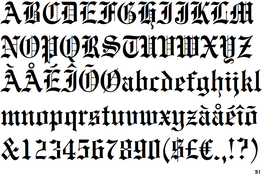
 |
The upper-case 'Q' tail crosses the circle.
|
 |
The top storey of the '3' is a smooth curve.
|
 |
The upper-case 'E' is normal letter shape.
|
 |
The foot of the '4' has double-sided serifs.
|
 |
The lower-case 't' has double-sided bar which forms a right-angle with the vertical.
|