Identifont

Fonts by Appearance

Fonts by Name

Fonts by Similarity

Fonts by Picture

Fonts by Designer/Publisher

Differences

TweetTweet Differences

Compare: and  

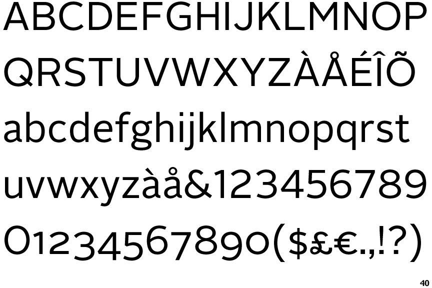
Alright Sans

Alright Sans

Crosses
The upper-case 'Q' tail crosses the circle.
Open
The '&' (ampersand) is traditional style with a gap at the top.
On
The upper-case 'J' sits on the baseline.
Round
The top storey of the '3' is a smooth curve.
Plain
The 'l' (lower-case 'L') has no serifs or tail.

Note that the fonts in the icons shown above represent general examples, not necessarily the two fonts chosen for comparison.

Show Examples
FF Utility

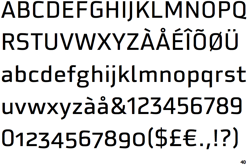
FF Utility

Touches
The upper-case 'Q' tail touches the circle.
Closed
The '&' (ampersand) is traditional style with two enclosed loops.
Below
The upper-case 'J' descends below the baseline.
Angled
The top storey of the '3' is a sharp angle.
Right
The 'l' (lower-case 'L') has a right-facing lower serif or tail.