 |
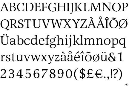
The '&' (ampersand) is traditional style with a gap at the top.
|
 |
The lower-case 'g' is double-storey (with or without gap).
|
 |
The upper-case 'U' has no stem/serif.
|
 |
The centre bar of the upper-case 'E' has no serifs.
|
 |
The top of the lower-case 'q' has a vertical or slightly angled spur (pointed or flat).
|
 |
The centre vertex of the upper-case 'W' has no serifs.
|
 |
The bar of the upper-case 'G' is single-sided, left-facing.
|
 |
The top of the '7' has no serif or bar.
|
 |
The centre bar of the upper-case 'F' has no serifs.
|
 |
The top vertices of the upper-case 'M' have symmetrical single-sided serifs.
|
Note that the fonts in the icons shown above represent general examples, not necessarily the two fonts chosen for comparison.
Show Examples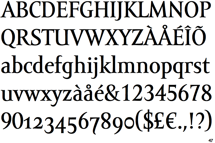
 |
The '&' (ampersand) is traditional style with two enclosed loops.
|
 |
The lower-case 'g' is single-storey (with or without loop).
|
 |
The upper-case 'U' has a stem/serif.
|
 |
The centre bar of the upper-case 'E' has serifs.
|
 |
The top of the lower-case 'q' has a right-facing serif.
|
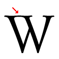 |
The centre vertex of the upper-case 'W' has centre serifs joined to the left serif.
|
 |
The bar of the upper-case 'G' is double-sided.
|
 |
The top of the '7' has a downward-pointing serif or bar.
|
 |
The centre bar of the upper-case 'F' has serifs.
|
 |
The top vertices of the upper-case 'M' have no top serifs.
|