 |
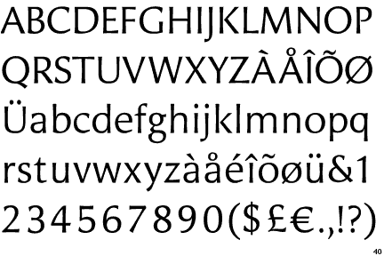
The '&' (ampersand) is traditional style with a gap at the top.
|
 |
The centre bar of the upper-case 'P' leaves a gap with the vertical.
|
 |
The tail of the lower-case 'y' is curved or U-shaped to the left.
|
 |
The lower-case 't' has double-sided bar which forms a diagonal with the vertical.
|
 |
The junction of the upper-case 'K' leaves a visible gap with the vertical.
|
Note that the fonts in the icons shown above represent general examples, not necessarily the two fonts chosen for comparison.
Show Examples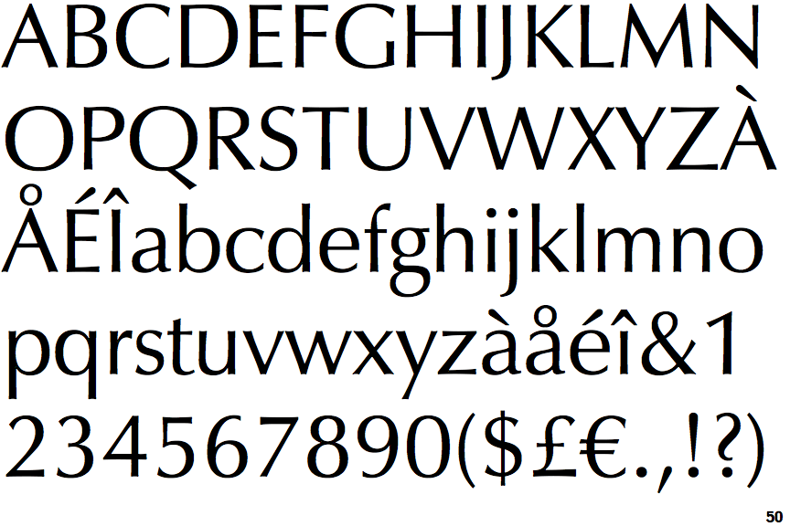
 |
The '&' (ampersand) is traditional style with two enclosed loops.
|
 |
The centre bar of the upper-case 'P' meets the vertical.
|
 |
The tail of the lower-case 'y' is substantially straight.
|
 |
The lower-case 't' has double-sided bar which forms a right-angle with the vertical.
|
 |
The junction of the upper-case 'K' touches the vertical.
|