 |
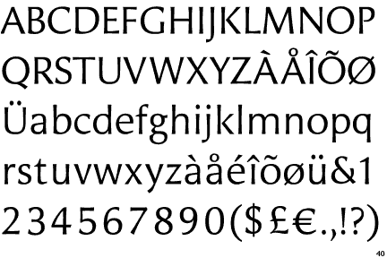
The '$' (dollar) has a single line crossing the 'S'.
|
 |
The '&' (ampersand) is traditional style with a gap at the top.
|
 |
The '4' is closed.
|
 |
The centre bar of the upper-case 'P' leaves a gap with the vertical.
|
 |
The lower-case 'g' is double-storey (with or without gap).
|
 |
The lower-case 'e' has a straight horizontal bar.
|
 |
The straight strokes vary in thickness (stressed strokes).
|
Note that the fonts in the icons shown above represent general examples, not necessarily the two fonts chosen for comparison.
Show Examples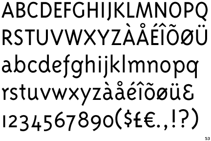
 |
The '$' (dollar) has a single line which does not cross the 'S'.
|
 |
The '&' (ampersand) looks like 'Et' with a gap at the top.
|
 |
The '4' is open.
|
 |
The centre bar of the upper-case 'P' meets the vertical.
|
 |
The lower-case 'g' is single-storey (with or without loop).
|
 |
The lower-case 'e' has a curved bar with no straight segment.
|
 |
The straight strokes are constant thickness (unstressed).
|