 |
The '&' (ampersand) looks like 'Et' with a gap at the top.
|
 |
The upper-case 'J' sits on the baseline.
|
 |
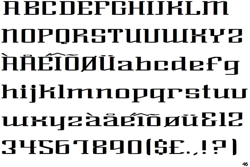
The characters have serifs.
|
 |
The dot on the '?' (question-mark) is circular or oval.
|
 |
The upper-case 'U' has a stem/serif.
|
 |
The lower-case 'e' has a straight angled bar.
|
 |
The dot on the lower-case 'i' or 'j' is circular or oval.
|
 |
The tail of the upper-case 'Q' is curved, S-shaped, or Z-shaped.
|
 |
The top of the '7' has a downward-pointing serif or bar.
|
 |
The bar of the '4' crosses the vertical.
|
Note that the fonts in the icons shown above represent general examples, not necessarily the two fonts chosen for comparison.
Show Examples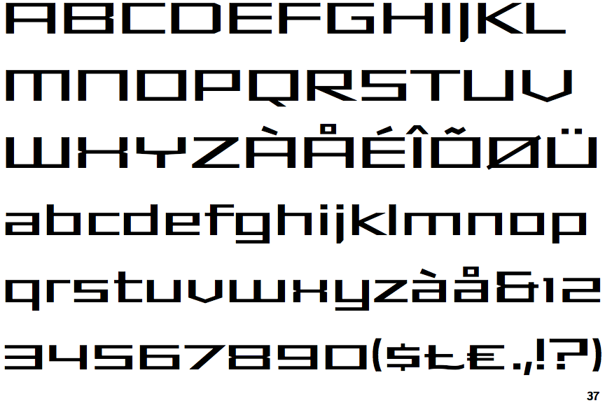
 |
The '&' (ampersand) looks like 'Et' with one enclosed loop (with or without exit stroke).
|
 |
The upper-case 'J' descends below the baseline.
|
 |
The characters do not have serifs.
|
 |
The dot on the '?' (question-mark) is square or rectangular.
|
 |
The upper-case 'U' has no stem/serif.
|
 |
The lower-case 'e' has a straight horizontal bar.
|
 |
The dot on the lower-case 'i' or 'j' is square or rectangular.
|
 |
The tail of the upper-case 'Q' is straight (horizontal, diagonal, or vertical).
|
 |
The top of the '7' has no serif or bar.
|
 |
The bar of the '4' does not cross the vertical.
|