 |
The centre bar of the upper-case 'P' meets the vertical.
|
 |
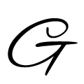
The upper-case 'G' has double-sided bar.
|
 |
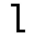
The 'l' (lower-case 'L') has a right-facing lower serif or tail.
|
 |
The lower-case 'i' has a right-facing lower serif or tail.
|
 |
The tail of the upper-case 'T' curves to the left.
|
 |
The top of the upper-case 'W' has three upper terminals.
|
 |
The upper-case 'G' tail is straight.
|
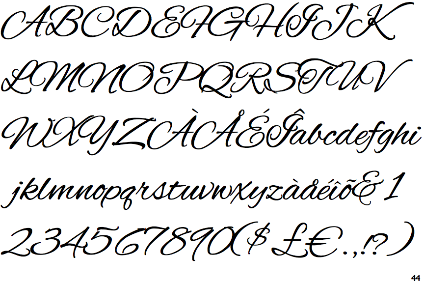
Note that the fonts in the icons shown above represent general examples, not necessarily the two fonts chosen for comparison.
Show Examples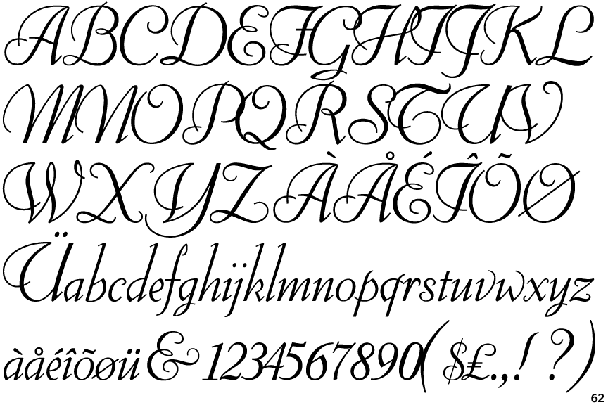
 |
The centre bar of the upper-case 'P' leaves a gap with the vertical.
|
 |
The upper-case 'G' has no bar.
|
 |
The 'l' (lower-case 'L') has a left-facing upper serif and right-facing lower serif or tail.
|
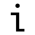 |
The lower-case 'i' has a left-facing upper serif and right-facing lower serif or tail.
|
 |
The tail of the upper-case 'T' curves to the right.
|
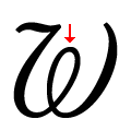 |
The top of the upper-case 'W' has an enclosed loop.
|
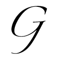 |
The upper-case 'G' tail is backward pointing, no loop.
|