Identifont

Fonts by Appearance

Fonts by Name

Fonts by Similarity

Fonts by Picture

Fonts by Designer/Publisher

Differences

TweetTweet Differences

Compare: and  

Aleksei

Aleksei

On
The upper-case 'J' sits on the baseline.
Sloping
The verticals of the upper-case 'M' are sloping.

Note that the fonts in the icons shown above represent general examples, not necessarily the two fonts chosen for comparison.

Show Examples
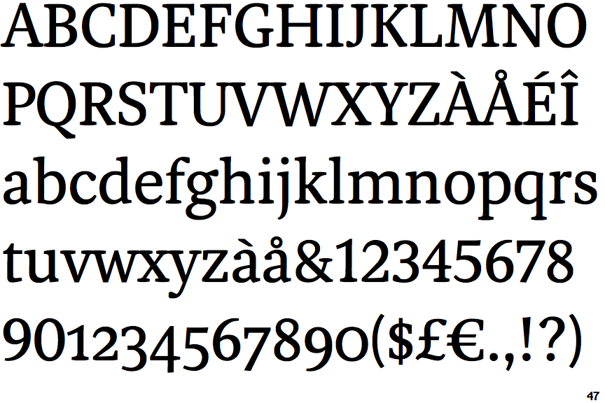
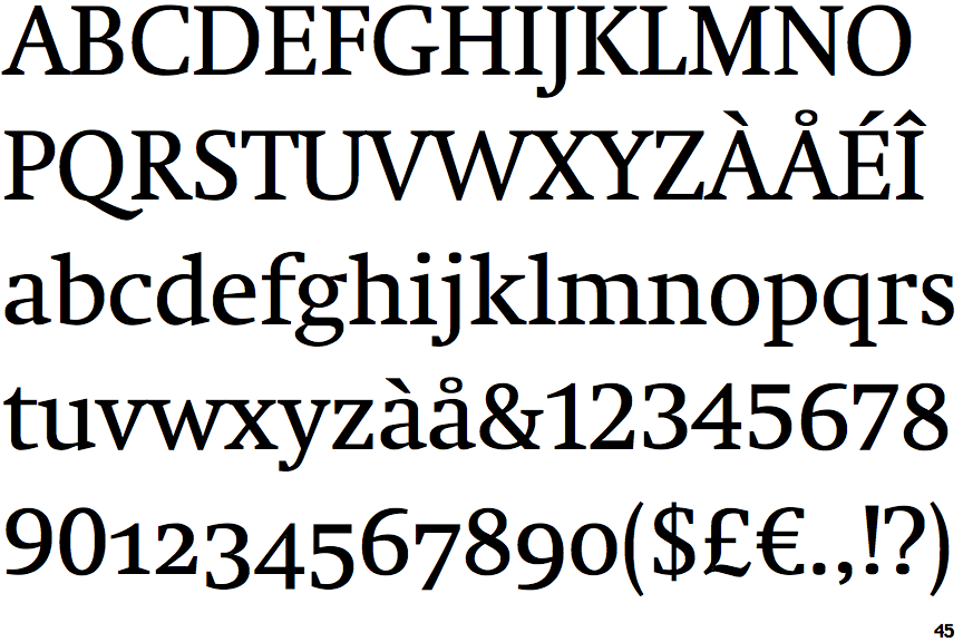
Neue Swift

Neue Swift

Below
The upper-case 'J' descends below the baseline.
Parallel
The verticals of the upper-case 'M' are parallel.