 |
The centre bar of the upper-case 'P' leaves a gap with the vertical.
|
 |
The centre bar of the upper-case 'E' has no serifs.
|
 |
The centre bar of the upper-case 'R' leaves a gap with the vertical.
|
 |
The tail of the upper-case 'J' has a flat end or cusp.
|
 |
The centre vertex of the upper-case 'W' has no serifs.
|
 |
The feet of the lower-case 'h' have two serifs on the left and one on the right.
|
 |
The leg of the upper-case 'K' has a single right-pointing serif or foot.
|
 |
The centre bar of the upper-case 'F' has no serifs.
|
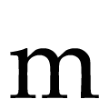 |
The feet of the lower-case 'm' have two serifs on the left and centre and one on the right.
|
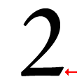 |
The base of the '2' has no serif.
|
There are more than ten differences; only the first ten are shown.
Note that the fonts in the icons shown above represent general examples, not necessarily the two fonts chosen for comparison.
Show Examples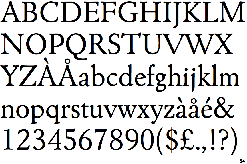
 |
The centre bar of the upper-case 'P' meets the vertical.
|
 |
The centre bar of the upper-case 'E' has serifs.
|
 |
The centre bar of the upper-case 'R' meets the vertical.
|
 |
The tail of the upper-case 'J' has a tapered end.
|
 |
The centre vertex of the upper-case 'W' has two separate serifs.
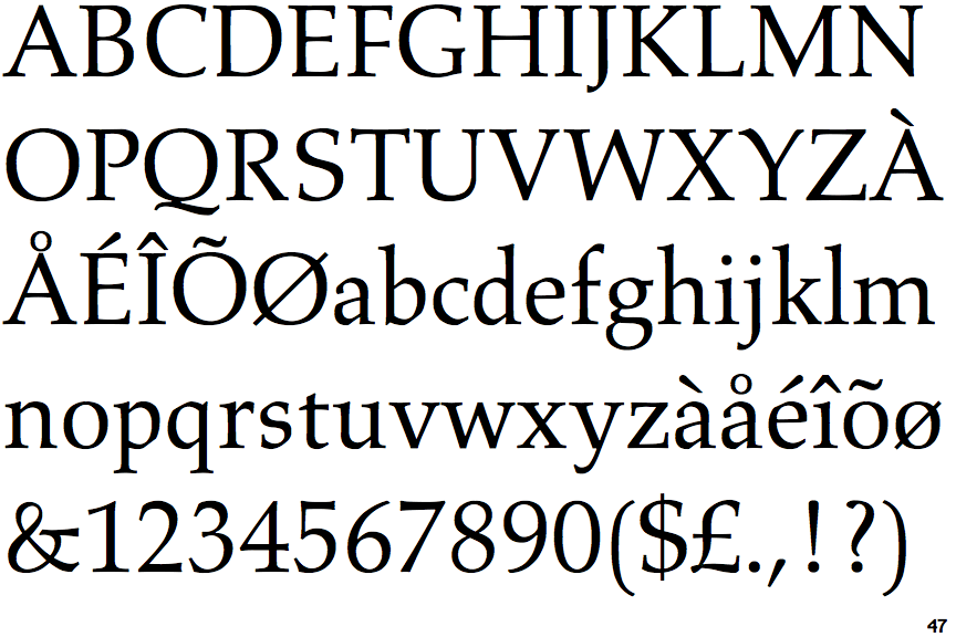
|
 |
The feet of the lower-case 'h' have two serifs on each foot.
|
 |
The leg of the upper-case 'K' has two serifs.
|
 |
The centre bar of the upper-case 'F' has serifs.
|
 |
The feet of the lower-case 'm' have two serifs on each foot.
|
 |
The base of the '2' has an upward-pointing serif.
|