Identifont

Fonts by Appearance

Fonts by Name

Fonts by Similarity

Fonts by Picture

Fonts by Designer/Publisher

Differences

TweetTweet Differences

Compare: and  

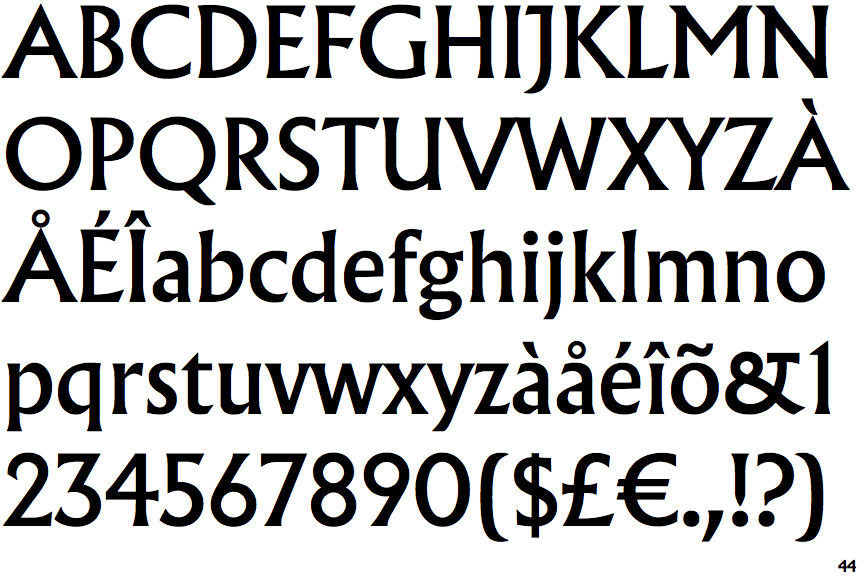
Albertus Nova

Albertus Nova

Above
The centre vertex of the upper-case 'M' is above the baseline.
Parallel
The verticals of the upper-case 'M' are parallel.
Angled
The top storey of the '3' is a sharp angle.
No Serifs
The centre bar of the upper-case 'E' has no serifs.

Note that the fonts in the icons shown above represent general examples, not necessarily the two fonts chosen for comparison.

Show Examples
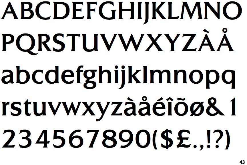
CG Triplett Light

CG Triplett Light

Baseline
The centre vertex of the upper-case 'M' is on the baseline.
Sloping
The verticals of the upper-case 'M' are sloping.
Round
The top storey of the '3' is a smooth curve.
Serifs
The centre bar of the upper-case 'E' has serifs.