 |
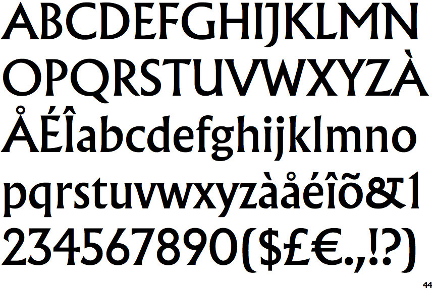
The '&' (ampersand) is traditional style with two enclosed loops.
|
 |
The centre vertex of the upper-case 'M' is above the baseline.
|
 |
The verticals of the upper-case 'M' are parallel.
|
 |
The top storey of the '3' is a sharp angle.
|
 |
The upper-case 'U' has a stem/serif.
|
 |
The upper-case 'J' has a bar to the left.
|
 |
The centre bar of the upper-case 'R' meets the vertical.
|
 |
The top vertices of the upper-case 'M' have symmetrical single-sided serifs.
|
Note that the fonts in the icons shown above represent general examples, not necessarily the two fonts chosen for comparison.
Show Examples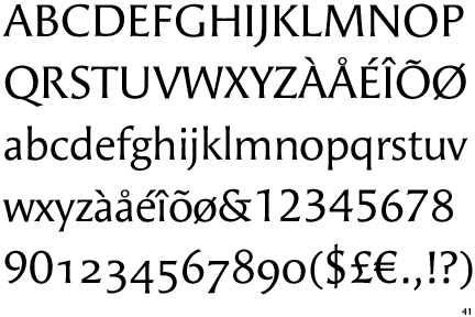
 |
The '&' (ampersand) is traditional style with a gap at the top.
|
|
The centre vertex of the upper-case 'M' is on the baseline.
|
 |
The verticals of the upper-case 'M' are sloping.
|
 |
The top storey of the '3' is a smooth curve.
|
 |
The upper-case 'U' has no stem/serif.
|
 |
The upper-case 'J' has no bar.
|
 |
The centre bar of the upper-case 'R' leaves a gap with the vertical.
|
 |
The top vertices of the upper-case 'M' have no top serifs.
|