 |
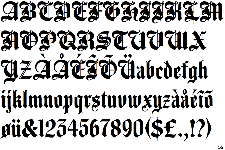
The '$' (dollar) has a single line crossing the 'S'.
|
 |
The top storey of the '3' is a sharp angle.
|
 |
The lower-case 'a' stem curves over the top of the bowl (double storey).
|
 |
The upper-case 'E' is drawn as a 'C' with a bar.
|
 |
The sides of the lower-case 'y' are parallel (U-shaped).
|
 |
The '7' has no bar.
|
 |
The characters are blackletter.
|
 |
The character outlines are smooth/sharp.
|
 |
The tail of the lower-case 'f' sits on the baseline.
|
Note that the fonts in the icons shown above represent general examples, not necessarily the two fonts chosen for comparison.
Show Examples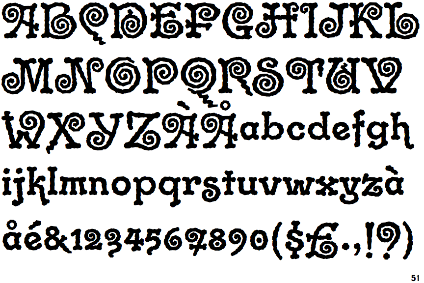
 |
The '$' (dollar) has a single line which does not cross the 'S'.
|
 |
The top storey of the '3' is a smooth curve.
|
 |
The lower-case 'a' stem stops at the top of the bowl (single storey).
|
 |
The upper-case 'E' is normal letter shape.
|
 |
The sides of the lower-case 'y' are angled (V-shaped).
|
 |
The '7' has a bar.
|
 |
The characters are plain.
|
 |
The character outlines are corroded, roughened, or dirty.
|
 |
The tail of the lower-case 'f' descends below the baseline.
|