Differences
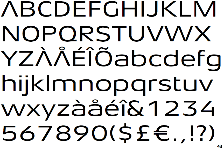
Aeonis Extended
 |
The '$' (dollar) has a single line which does not cross the 'S'.
|
 |
The '&' (ampersand) is traditional style with a gap at the top.
|
 |
The '4' is open.
|
 |
The diagonal strokes of the upper-case 'K' meet at the vertical (with or without a gap).
|
 |
The top storey of the '3' is a sharp angle.
|
 |
The upper-case 'G' has no spur/tail.
|
 |
The upper-case 'G' has no bar.
|
 |
The top of the lower-case 'q' has no spur or serif.
|
 |
The tail of the lower-case 'y' is substantially straight.
|
 |
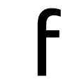
The bar of the lower-case 'f' is single-sided.
|
There are more than ten differences; only the first ten are shown.
Note that the fonts in the icons shown above represent general examples, not necessarily the two fonts chosen for comparison.
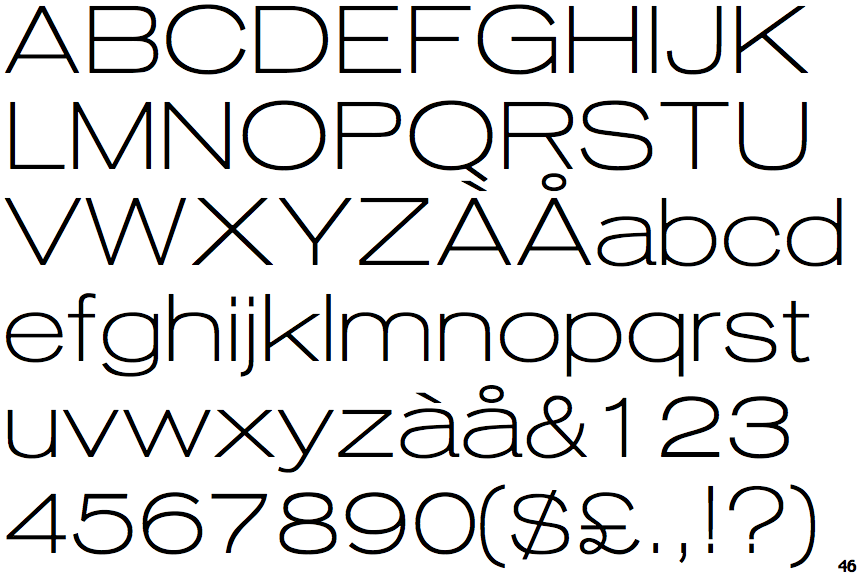
Show ExamplesGothic Extra Light Extended
 |
The '$' (dollar) has a single line crossing the 'S'.
|
 |
The '&' (ampersand) is traditional style with two enclosed loops.
|
 |
The '4' is closed.
|
 |
The diagonal strokes of the upper-case 'K' meet in a 'T'.
|
 |
The top storey of the '3' is a smooth curve.
|
 |
The upper-case 'G' has a spur/tail.
|
 |
The upper-case 'G' has a bar to the left.
|
 |
The top of the lower-case 'q' has a vertical or slightly angled spur (pointed or flat).
|
 |
The tail of the lower-case 'y' is curved or U-shaped to the left.
|
 |
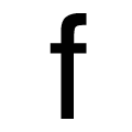
The bar of the lower-case 'f' is double-sided.
|

