Identifont

Fonts by Appearance

Fonts by Name

Fonts by Similarity

Fonts by Picture

Fonts by Designer/Publisher

Differences

TweetTweet Differences

Compare: and  

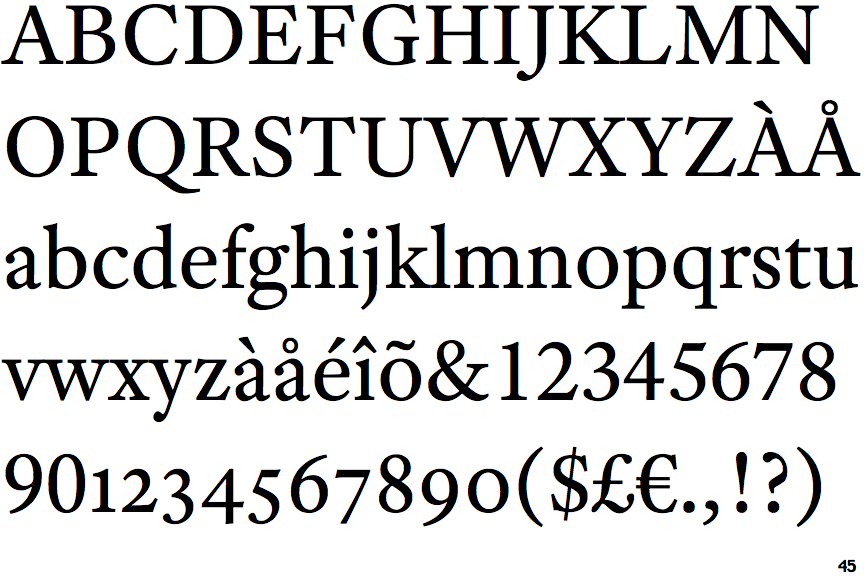
Adobe Text

Adobe Text

Below
The upper-case 'J' descends below the baseline.
Double
The diagonal strokes of the upper-case 'K' meet in a 'T'.
Serif
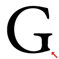
The upper-case 'G' foot has a forward pointing spur or serif.

Note that the fonts in the icons shown above represent general examples, not necessarily the two fonts chosen for comparison.

Show Examples
Leitura News Roman 2

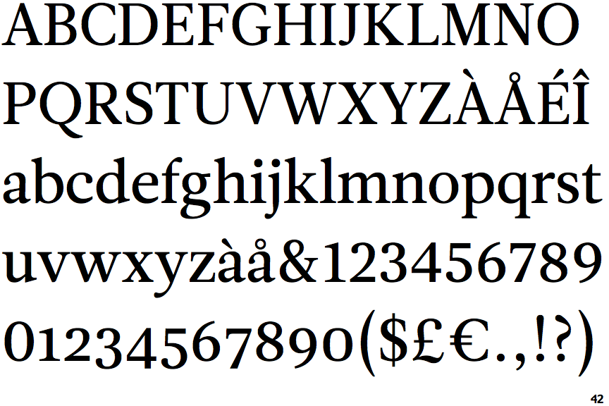
Leitura News Roman 2

On
The upper-case 'J' sits on the baseline.
Bar
The diagonal strokes of the upper-case 'K' connect to the vertical via a horizontal bar.
No-Spur
The upper-case 'G' foot has no spur or serif.