 |
The '&' (ampersand) is traditional style with two enclosed loops.
|
 |
The diagonal strokes of the upper-case 'K' meet at the vertical (with or without a gap).
|
 |
The centre bar of the upper-case 'P' leaves a gap with the vertical.
|
 |
The lower-case 'a' stem curves over the top of the bowl (double storey).
|
 |
The upper-case 'G' foot has a forward pointing spur or serif.
|
 |
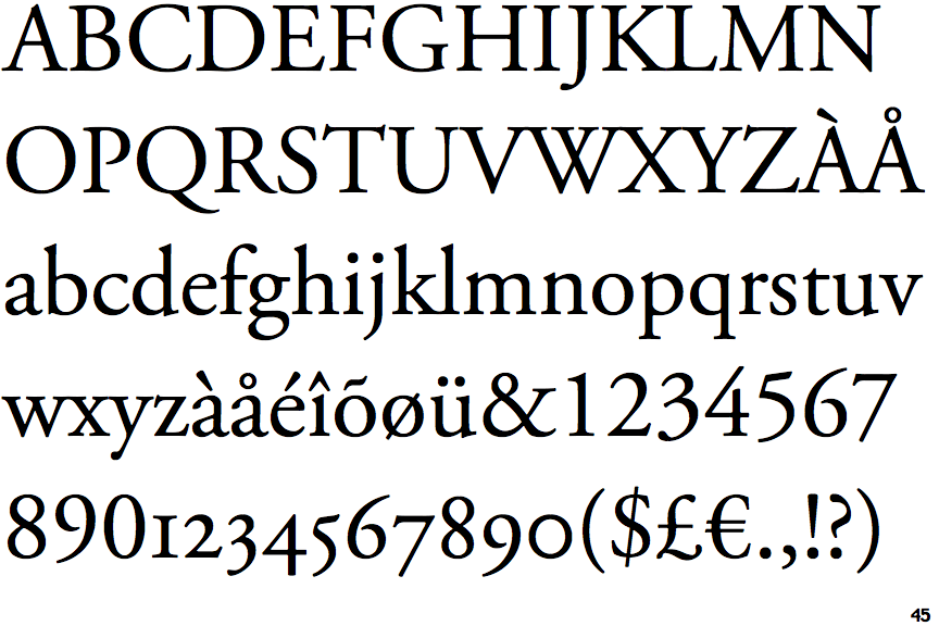
The strokes are upright.
|
 |
The lower-case 'e' has a straight horizontal bar.
|
 |
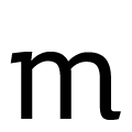
The feet of the lower-case 'm' have two serifs on each foot.
|
 |
The tail of the lower-case 'f' sits on the baseline.
|
 |
The foot of the '£' (pound) has no loop.
|
Note that the fonts in the icons shown above represent general examples, not necessarily the two fonts chosen for comparison.
Show Examples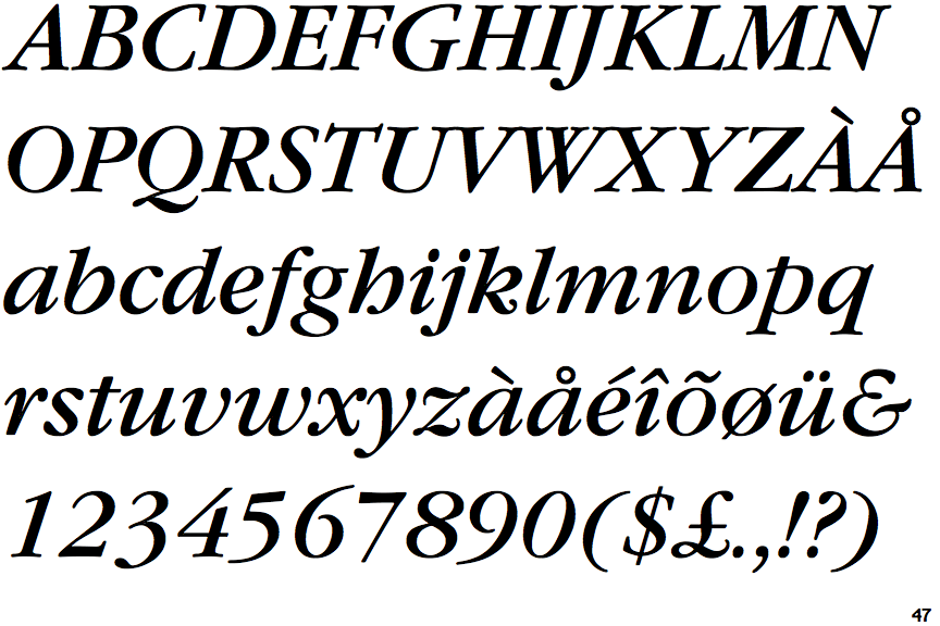
 |
The '&' (ampersand) looks like 'Et' with a gap at the top.
|
 |
The diagonal strokes of the upper-case 'K' meet in a 'T'.
|
 |
The centre bar of the upper-case 'P' meets the vertical.
|
 |
The lower-case 'a' stem stops at the top of the bowl (single storey).
|
 |
The upper-case 'G' foot has no spur or serif.
|
 |
The strokes are sloped right (italic, oblique, or cursive).
|
 |
The lower-case 'e' has a curved bar with no straight segment.
|
 |
The feet of the lower-case 'm' have one serif on the right foot only, or no serifs.
|
 |
The tail of the lower-case 'f' descends below the baseline.
|
 |
The foot of the '£' (pound) has a loop.
|