Differences
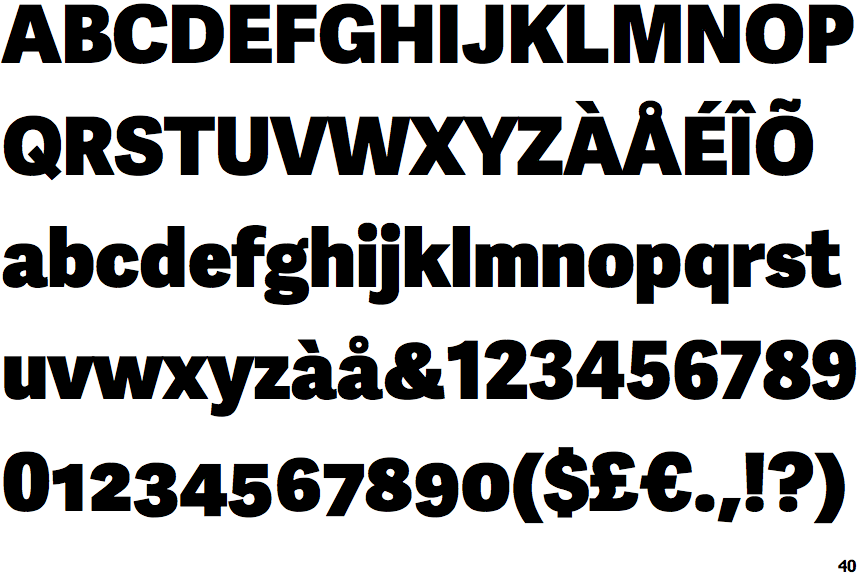
Adelle Sans Heavy
 |
The upper-case 'Q' tail crosses the circle.
|
 |
The diagonal strokes of the upper-case 'K' meet in a 'T'.
|
 |
The verticals of the upper-case 'M' are parallel.
|
 |
The lower-case 'g' is double-storey (with or without gap).
|
 |
The upper-case 'G' has a spur/tail.
|
 |
The top of the lower-case 'q' has a vertical or slightly angled spur (pointed or flat).
|
Note that the fonts in the icons shown above represent general examples, not necessarily the two fonts chosen for comparison.
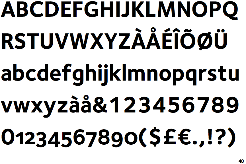
Show ExamplesFoundry Sterling Bold
 |
The upper-case 'Q' tail touches the circle.
|
 |
The diagonal strokes of the upper-case 'K' meet at the vertical (with or without a gap).
|
 |
The verticals of the upper-case 'M' are sloping.
|
 |
The lower-case 'g' is single-storey (with or without loop).
|
 |
The upper-case 'G' has no spur/tail.
|
 |
The top of the lower-case 'q' has no spur or serif.
|

