Identifont

Fonts by Appearance

Fonts by Name

Fonts by Similarity

Fonts by Picture

Fonts by Designer/Publisher

Differences

TweetTweet Differences

Compare: and  

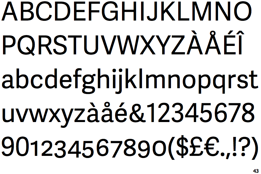
Adelle Sans

Adelle Sans

Crosses
The upper-case 'Q' tail crosses the circle.
Closed
The '&' (ampersand) is traditional style with two enclosed loops.
On
The upper-case 'J' sits on the baseline.
Parallel
The verticals of the upper-case 'M' are parallel.
2-Storey
The lower-case 'g' is double-storey (with or without gap).

Note that the fonts in the icons shown above represent general examples, not necessarily the two fonts chosen for comparison.

Show Examples
FF Scuba

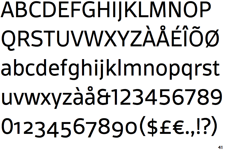
FF Scuba

Touches
The upper-case 'Q' tail touches the circle.
Et shaped
The '&' (ampersand) looks like 'Et' with one enclosed loop (with or without exit stroke).
Below
The upper-case 'J' descends below the baseline.
Sloping
The verticals of the upper-case 'M' are sloping.
1-Storey
The lower-case 'g' is single-storey (with or without loop).