Identifont

Fonts by Appearance

Fonts by Name

Fonts by Similarity

Fonts by Picture

Fonts by Designer/Publisher

Differences

TweetTweet Differences

Compare: and  

Adelle

Adelle

Serif
The characters have serifs.
Above
The centre vertex of the upper-case 'M' is above the baseline.
Parallel
The verticals of the upper-case 'M' are parallel.
Spur
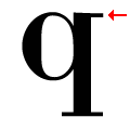
The top of the lower-case 'q' has a vertical or slightly angled spur (pointed or flat).
No gap
The lower storey of the lower-case 'g' has no gap.

Note that the fonts in the icons shown above represent general examples, not necessarily the two fonts chosen for comparison.

Show Examples
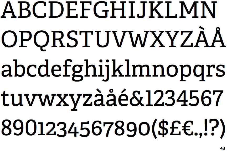
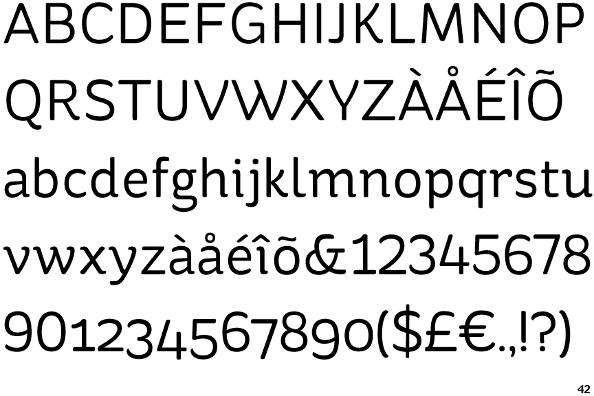
St Ryde

St Ryde

Sans-serif
The characters do not have serifs.
Baseline
The centre vertex of the upper-case 'M' is on the baseline.
Sloping
The verticals of the upper-case 'M' are sloping.
Serif
The top of the lower-case 'q' has a right-facing serif.
Gap
The lower storey of the lower-case 'g' has a gap.