 |
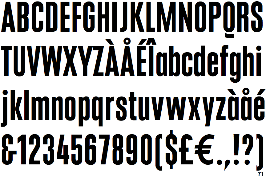
The upper-case 'Q' tail is below and separated from the circle.
|
 |
The '&' (ampersand) looks like 'Et' with a gap at the top.
|
 |
The '4' is open.
|
 |
The diagonal strokes of the upper-case 'K' meet at the vertical (with or without a gap).
|
 |
The dot on the '?' (question-mark) is circular or oval.
|
 |
The lower-case 'a' stem stops at the top of the bowl (single storey).
|
 |
The top of the lower-case 'q' has a vertical or slightly angled spur (pointed or flat).
|
 |
The dot on the lower-case 'i' or 'j' is circular or oval.
|
 |
The lower-case 'u' has a stem/serif.
|
 |
The '1' (digit one) has no base.
|
Note that the fonts in the icons shown above represent general examples, not necessarily the two fonts chosen for comparison.
Show Examples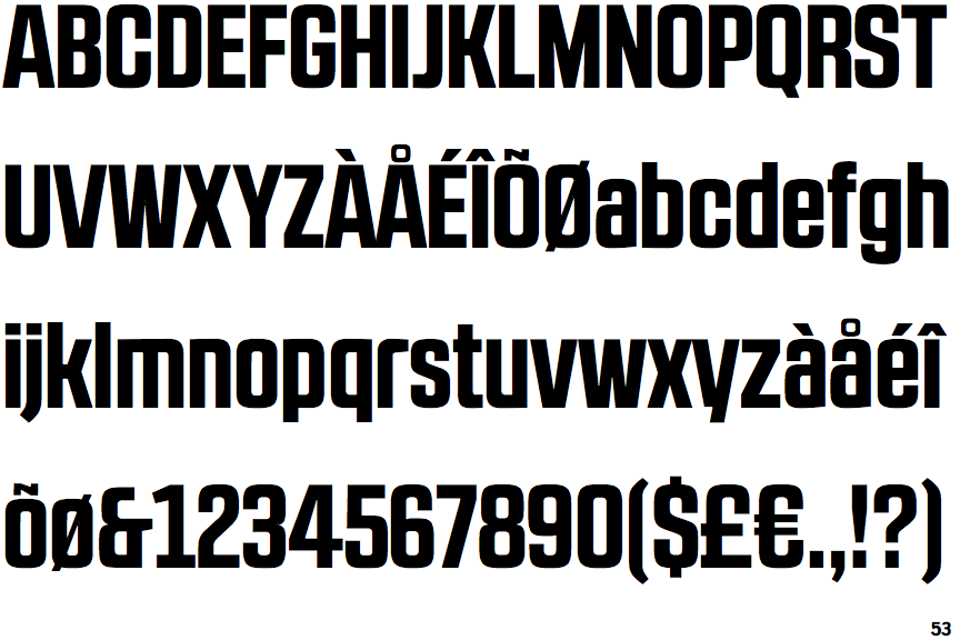
 |
The upper-case 'Q' tail touches the circle.
|
 |
The '&' (ampersand) looks like 'Et' with one enclosed loop (with or without exit stroke).
|
 |
The '4' is closed.
|
 |
The diagonal strokes of the upper-case 'K' connect to the vertical via a horizontal bar.
|
 |
The dot on the '?' (question-mark) is square or rectangular.
|
 |
The lower-case 'a' stem curves over the top of the bowl (double storey).
|
 |
The top of the lower-case 'q' has no spur or serif.
|
 |
The dot on the lower-case 'i' or 'j' is square or rectangular.
|
 |
The lower-case 'u' has no stem/serif.
|
 |
The '1' (digit one) has double-sided base or serifs.
|