 |
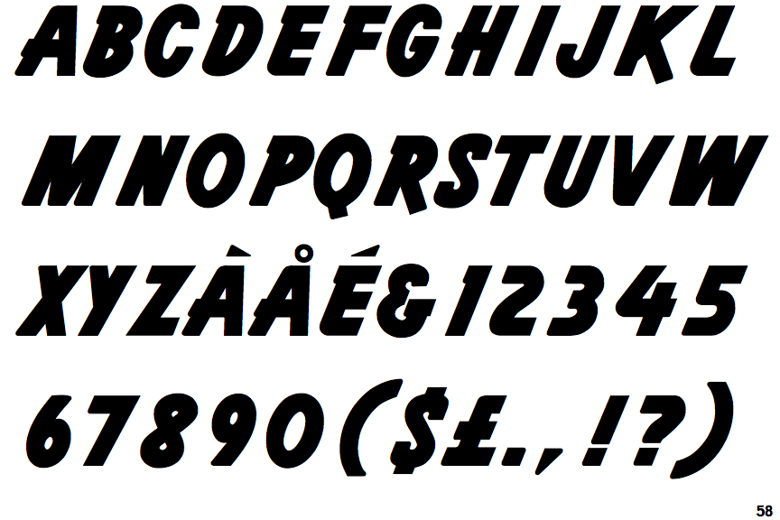
The '&' (ampersand) looks like 'Et' with a gap at the top.
|
 |
The '4' is open.
|
 |
The centre vertex of the upper-case 'M' is on the baseline.
|
 |
The dot on the '?' (question-mark) is square or rectangular.
|
 |
The upper-case 'Y' right-hand arm forms a continuous stroke with the tail.
|
 |
The strokes are sloped right (italic, oblique, or cursive).
|
 |
The upper-case letter 'I' is plain.
|
Note that the fonts in the icons shown above represent general examples, not necessarily the two fonts chosen for comparison.
Show Examples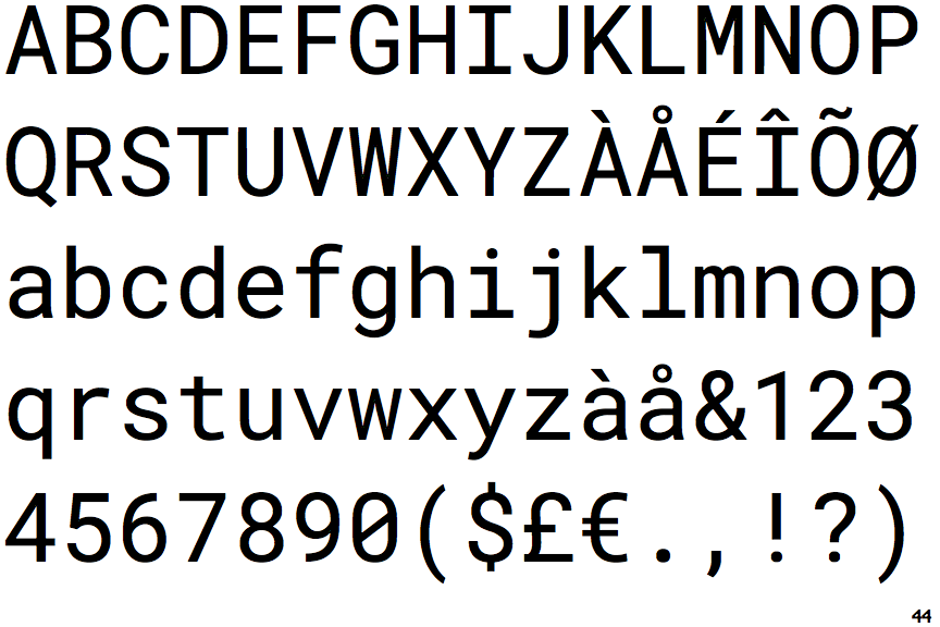
 |
The '&' (ampersand) is traditional style with two enclosed loops.
|
 |
The '4' is closed.
|
 |
The centre vertex of the upper-case 'M' is above the baseline.
|
 |
The dot on the '?' (question-mark) is circular or oval.
|
 |
The upper-case 'Y' arms and tail are separate strokes.
|
 |
The strokes are upright.
|
 |
The upper-case letter 'I' has serifs/bars.
|