Identifont

Fonts by Appearance

Fonts by Name

Fonts by Similarity

Fonts by Picture

Fonts by Designer/Publisher

Differences

TweetTweet Differences

Compare: and  

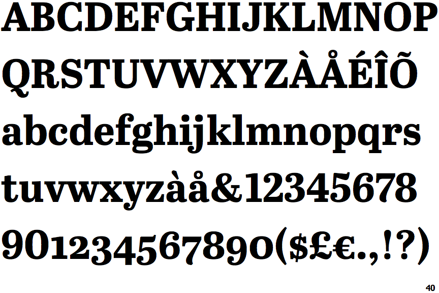
Abril Text Bold

Abril Text Bold

Touches
The upper-case 'Q' tail touches the circle.
Closed
The '4' is closed.
No gap
The lower storey of the lower-case 'g' has no gap.
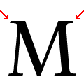
Single
The top vertices of the upper-case 'M' have symmetrical single-sided serifs.
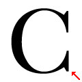
Lower Serif
The lower stroke of the upper-case 'C' has a downward-pointing serif.

Note that the fonts in the icons shown above represent general examples, not necessarily the two fonts chosen for comparison.

Show Examples
Ingeborg Bold

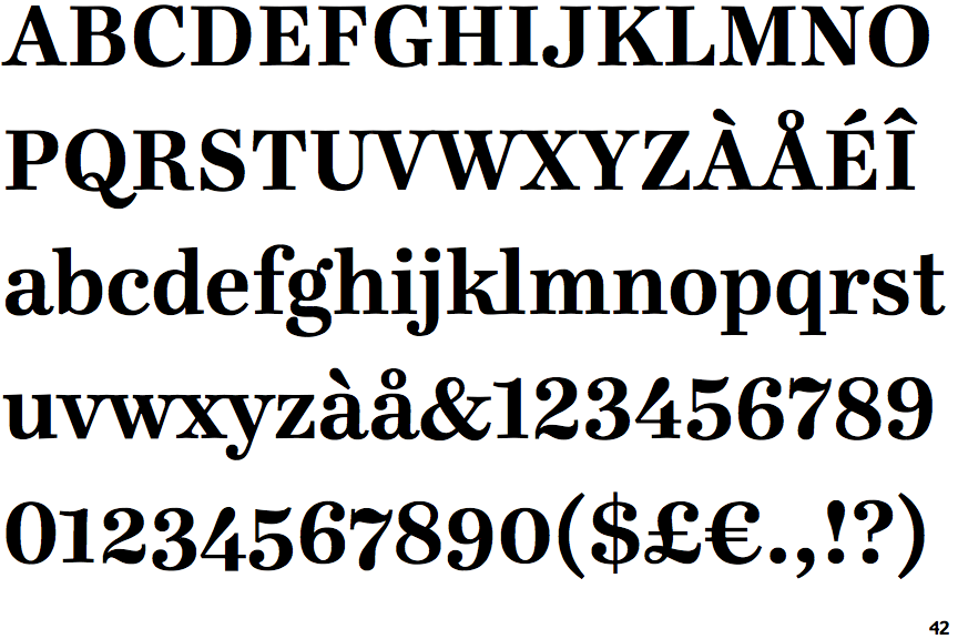
Ingeborg Bold

Crosses
The upper-case 'Q' tail crosses the circle.
Open
The '4' is open.
Gap
The lower storey of the lower-case 'g' has a gap.
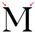
One-Two
The top vertices of the upper-case 'M' have one serif on the left, two on the right.
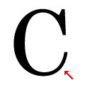
No Lower Serif
The lower stroke of the upper-case 'C' has no downward-pointing serif.