 |
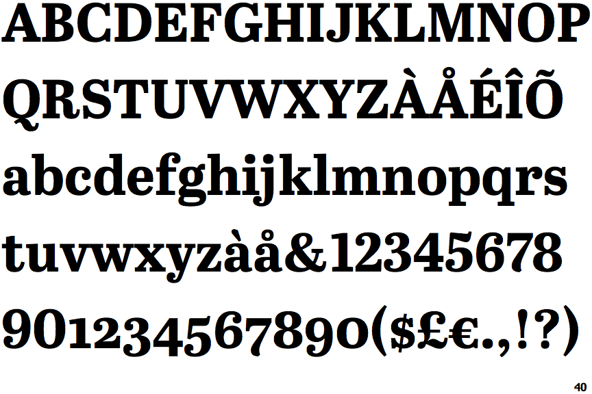
The upper-case 'G' foot has a downward pointing spur.
|
 |
The centre vertex of the upper-case 'W' has two separate serifs.
|
 |
The leg of the upper-case 'K' has two serifs.
|
 |
The upper-case 'C' is symmetrical about a horizontal axis.
|
Note that the fonts in the icons shown above represent general examples, not necessarily the two fonts chosen for comparison.
Show Examples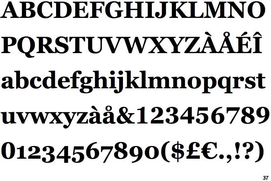
 |
The upper-case 'G' foot has no spur or serif.
|
 |
The centre vertex of the upper-case 'W' has no serifs.
|
 |
The leg of the upper-case 'K' has a single right-pointing serif or foot.
|
 |
The upper-case 'C' is asymmetrical about a horizontal axis.
|