 |
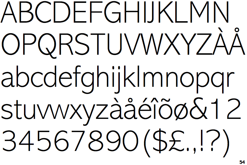
The '&' (ampersand) is traditional style with a gap at the top.
|
 |
The centre vertex of the upper-case 'M' is above the baseline.
|
 |
The upper-case 'A' has parallel verticals.
|
 |
The tail of the upper-case 'Q' is curved or S-shaped.
|
 |
The stem of the '7' is straight.
|
Note that the fonts in the icons shown above represent general examples, not necessarily the two fonts chosen for comparison.
Show Examples
 |
The '&' (ampersand) is traditional style with two enclosed loops.
|
 |
The centre vertex of the upper-case 'M' is on the baseline.
|
 |
The upper-case 'A' has tapered verticals.
|
 |
The tail of the upper-case 'Q' is straight.
|
 |
The stem of the '7' is curved inwards.
|