Differences
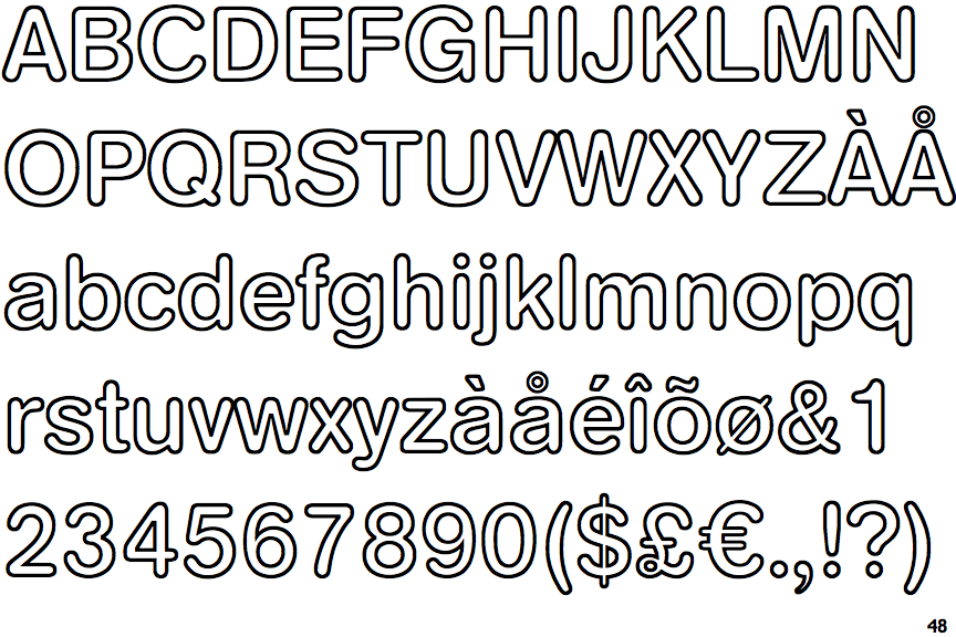
AG Book Rounded Outline
 |
The '&' (ampersand) is traditional style with two enclosed loops.
|
 |
The diagonal strokes of the upper-case 'K' meet in a 'T'.
|
 |
The top storey of the '3' is a smooth curve.
|
 |
The lower-case 'a' stem curves over the top of the bowl (double storey).
|
 |
The upper-case 'G' has a spur/tail.
|
 |
The leg of the upper-case 'R' is curved outwards.
|
 |
The upper-case 'A' has tapered verticals.
|
 |
The upper-case 'E' is normal letter shape.
|
 |
The sides of the lower-case 'y' are angled (V-shaped).
|
 |
The bar of the lower-case 'f' is double-sided.
|
There are more than ten differences; only the first ten are shown.
Note that the fonts in the icons shown above represent general examples, not necessarily the two fonts chosen for comparison.
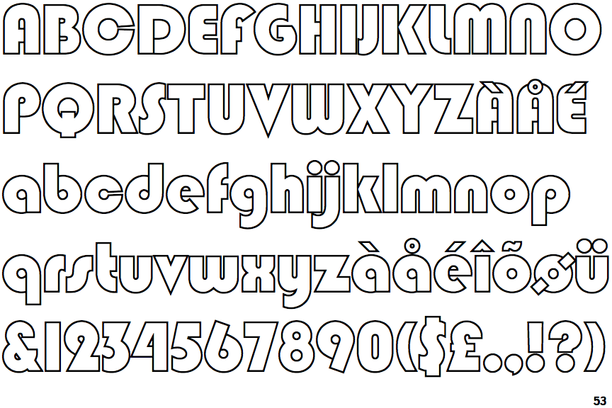
Show ExamplesBlippo Black Outline (URW)
 |
The '&' (ampersand) is traditional style with a gap at the top.
|
 |
The diagonal strokes of the upper-case 'K' meet at the vertical (with or without a gap).
|
 |
The top storey of the '3' is a sharp angle.
|
 |
The lower-case 'a' stem stops at the top of the bowl (single storey).
|
 |
The upper-case 'G' has no spur/tail.
|
 |
The leg of the upper-case 'R' is straight.
|
 |
The upper-case 'A' has parallel verticals.
|
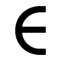 |
The upper-case 'E' is drawn as a 'C' with a bar.
|
 |
The sides of the lower-case 'y' are parallel (U-shaped).
|
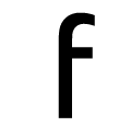 |
The bar of the lower-case 'f' is single-sided.
|
